Thursday, November 8, 2018

Post 53: Back to working on the Second Row

      The 8"x8" series of  nine panels seems a little small. It would not take any more time to make the same image a little bigger. So I ordered two packs of four 10"x10" wood panel from Amazon. At 6 bucks a piece, there is no way I will bother making them!
      I started finishing up the Second row of images, starting with this:


and ending up with this:


    I printed all the component images and background patterns, and started working on all 8 panel backgrounds with straight pigments, which I sprayed heavily with very diluted Gum Arabic to fix them. I find I can get particularly vivid colors this way.I laid some images on the panels to check that colors match:


      The most difficult will be the blue bird, because I want the image to melt into the background perfectly. The blue is about perfect, but the magenta on the botton needs a lot of adjustment.
      I will add a little more visual texture with pastels and spit, then spray again with the Gum Arabic solution.
     As I explained before, spitting does works well to texture backgrounds, and it's a way to put some of my DNA into the painting as an invisible signature. I like that.

Tuesday, October 16, 2018

Post 52: A Three Dimensional idea, for the "Temple of Wisdom"

    I was walking around the house  patio yesterday, and my eyes happened to fall on a "Dome Shape" sitting among the flowerpots. It immediately triggered the vision of some king of domed "Temple of Wisdom", something we are in dire need of in these troubled political times. It is made of fiberglass covered with a mosaic of perfectly fitted rows of thin stone squares. It was a vask used in a Greek style tripod bronze stand, but was dropped and broken. Our friend Mike salvaged it and roughly patched it, which I kinda like for the dome of a busted up, long abandonned and battered "Temple of Wisdom":


     It is 17.25" in diameter and 10" tall, which is a little odd, higher than half of a perfect sphere. It also immediately made me think of one of my favorite Architects ever: Claude Nicolas Ledoux
     With Etienne Louis Boullée and Jean-Jacques Lequeu, he is considered the main exponent of 18th century "Utopian Architecture" reflecting the "Revolutionary" ideals of "Liberté, Egalité, Fraternité".

      A Google search led me to a couple of watercolors by Lequeu for a "Temple de la Terre". The inscription above the door reads "A la Sagesse Suprême", which translates as " To Supreme Wisdom", exactly what we need the most:


    I also found a watercolor of a strange domed structure, a Folly I suppose:


     I can definitely already visualize a design combining all three concepts into one, using a stepped pedestal and columns all around the outside like the second, leaving peepholes around the base of the dome and door openings like the third, and using a background drawing of the globe on the outside of the dome like the first one. May be something along these lines:


     The cylindrical "wall" would bear drawings, words and images both on the outside and the inside(thus the peepholes and doors). LEDs would light the inside. I am wondering whether to also paint the inside of the dome itself... In this case, a mirrored "floor" would be needed to reflect it so it can be seen...
     It might end up looking something like this structurally, with added background drawings, and a lot of Grafitti:


      The wall of the temple is going to be cylindrical. However, I need to do the Encaustic work flat on the table. The only way I can think of doing this is to use two sheets of very thin wood veneer glued to a heavy paper backing(the same I used to make stained trompe l'oeil "wood frames". One will be the inside wall, the other the ouside wall. When finished, they will be rolled, and attached to wood studs coming out of the stepped base:


     In the meantime, I have spent hours researching "WISDOM", and sifting through thousands of "QUOTES" from all kinds of people from Antiquity to the present time. I favored short ones obviously, because they will become Grafitti, but also actually found that the shortests are usually the best. Wisdom should be distilled to its very essence, and it shouldn't take a thousand words to sum things up.
      I have long been a "Font Freak", and have a collection of thousands of unusual free fonts, including many "Grafitti Fonts". As I was collecting my favorite quotes, I copy/pasted them in Photoshop in different Grafitti Fonts to get an idea of how they would read:


Saturday, October 6, 2018

Post 51: Second Row Photoshop Mockups

   As it turns out, I like the 8 images on this row to try to finish all of them. All of them had basic colors and a few key images, but needed to be refined. My first concept for the 40 tiny 8" x8" panels was to keep them very simple, but it seems I am having a hard time doing that, perhaps because I am working on a 55" monitor, and look at 18" to 21"mockups, much larger than the 8"x8" panel size. But then I am happy with the result:


    Most of these would look good as 18"x18" panels, and in a way, all the detail is a bit "wasted" crammed in only 64 square inches. I want to do 2 more 8"x8" panels to bring the total to 9, so they can be displayed grouped as a 3x3 square, but the next one will be either 10"x10" or 12"x12".
     I will choose these two to execute right away in 8"x8", and finish them together with the 7 that are already almost finished:


Saturday, September 29, 2018

Post 50: Fourty "Tiny Squares" in the Works

   To make things easier, I cut the large image in 5 rows of 8 images, with plans to work on each row and complete it before going to the next, with the expectation that maybe 6 or 7 of the tentative images would lead to a finished piece.
    Starting with the first row, I began to refine the images. I was having a hard time with the last one, but the first seven came along nicely:


    At this stage, I dropped the last one, and split the row in seven separate images, each image sized 8"x8"at 300ppi. I started working on the 7 panels at the same time, primed with slightly thinned Golden Absorbent Ground (White). I use a couple of coats I sand lightly to even the surface, and finisg with a last coat applied with a 1" fine sponge roller that leaves an even fine texture that catches both straight pigment and pastel flat strokes nicely. I worked on all backgrounds simultaneously,  sprinkling pinches of different color pigments, rubbing them in with my fingers to a smooth finish covering part or all of each panel.
      I created textures with spitting, sprinkling or spraying very diluted gum Arabic on, tamping with hand and paper towels, sprinkling on more pigments, rubbing pastels on, scribbling with pastel pencils, rubbing with fingers, spattering with tooth brushes a mixture of water, pigment, Gum Arabic and a drop of Oxgall (basically watercolor), etc...
 

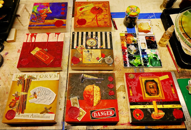
       When the basic backgrounds were done, I stated adding drawing and lettering in black and white pencil. After printing the various photographic images or groups of overlapping images (a basic trick of Trompe l'Oeil") with my Epson Archival Printer on my new very thin Matte Red River archival paper, I cut them out precisely, colored the edges with brush markers, started positioning them according to the Photoshop mockups, and moving them around to my satisfaction. At this point, no image is attached to the panels:


     Little by little, things get tried, changed, moved, adjusted, and the images are attached to the panels with very slightly thinned Archival YES paste. The wax seals are loose, and no encaustic has been applied yet. The shadows that will create the depth and the Trompe l'Oeil effects have not even been drawn yet:

    I will now let the panels sit for a few days and start working on the next row in Photoshop.


Tuesday, September 4, 2018

Post 49: Mission Accomplished, Time to get back to Work

   Mission accomplished. I put on the Encaustic layer, fused it, scraped it and polished it. I printed the "Secret Documents" to put in the "Secret Drawer at the bottom of the piece and hung the key on a nail.


    I finished "Magic Chalkboard" at 2:30 the day of the Auction, took it there at 5, and it was sold at 8.

     Now, back to work. I have several almost finished pieces on my Work Table that I should really go ahead and finish. Instead though, I decided to start on a series of small pieces that would sell in the $100 to $200 range. First, I considered 12” x 12”, which was the size of my early experiments with encaustics. However, I settled for 8”x8”, smaller than anything I had ever done, as a challenge. If you have read my blog, you know that I first design mocups of the pieces in Photoshop, using layers of textures and images from my ever increasing “collection”. That gives me a basic layout for the piece, though the final textures will be different. I print the images on an Archivel Epson Inkjet Printer on Archival Paper, cut them out precisely, collage them on my background with Archival Glue, add shadows and details with pastels and crayons, and finally cover the whole thing with clear Encaustic Medium(mostly Beeswax), which is melted with a heat gun, smoothed, scraped and polished. 
      I started mockups one by one, them discovered it was more fun and faster to work on triptychs. So I thought, why not do 9 at a time, in a neat 3 x 3 square. I created 9 different panels with different textures, colors, and geometry. I pulled a hundred or so images that attracted me from my collection, and started placing them wherever they seemed to in fit best. It worked well, and in a very natural way, just like I used to compose paintings out of my collection of actual objects. Things fall in place naturally, without even thinking. It is entirely instinctual at this stage. 
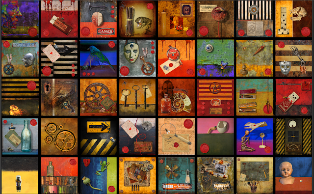
     It was going so smoothly that I felt I needed more backgrounds, and I went to 12(3 x 4), then to 16(4 x 4), 24(4 x 6), and finally, why not, I ended up with 40(5 x 8). Thank God( and 8 cores, 32GB of RAM, and 5 x 1TeraBite SSD’s, which I had to install to keep building and rendering my huge 3D worlds) Photoshop managed to handle a 10500 x 16875 image with hundreds of layers, though it actually refused to save it because it was bigger than the 2GB  limit, and I had to cut it in two to save it! 
    Here is a screenshot of it as it stands unfinished now. 


Post 48: Finishing "Magic Chalkboard

The piece as it stood reflected the situation I saw over a year ago, at the begining of the Trump Administration, and I had picked the Fisrt Amendment as a subject because I felt it was going to be seriously challenged by that unwanted #NotMyPresident. I had let it sit because I didn't want to overwork it and had already gone quite a bit beyond the original Photoshop mockup:


     That mockup was a very basic graphic composition, and it may well have made a better painting. I like it's simplicity. The problem is that this was a piece about the First Amendment, and I had things to say. This is where I had stopped a year or so ago, and what I had to finish:


    It looked really good, and I certainly could have decided it was finished, and just covered it with clear encaustic. But I felt in this case, overworking was probably the right thing to do, and I should try to put in there everything I had felt in the last year fighting the rise of Fascism in this Country, and the constant threats made against the First Amendment by a would be Authoritarian President run amok.
     The First Amendment has litterally been attacked almost daily, the President would clearly like to curtail the Freedom of the Press, the People Right to Asylum has been trampled, and Children have been Separated from their Families, Caged, Drugged, Abused, and Dragged before a Judge at the age of five. Worse, a thousand of them have been lost and may never be reunited with their mother. This is a violation of International Law and a CRIME AGAINST HUMANITY. Not only is this Government corrupt to the core, it is criminal, probably even more than we currently imagine.
We have been subjected daily to a deluge of misinformation, desinformation, and outright lies. The Republicans have sold their souls to the Devil in order to achieve the goals of the Koch Brothers, the Environment is being raped, the Regulatory Agencies are being dismantled under our powerless eyes, we have Warmomgers whispering in the President ear, and the President himself is peddling hate and xenophobia.
     Worse of all, a lot of Americans are complicit, either actively or passively. Our fate depends on the 100 millions of people that did not bother to go to the Polls and VOTE in 2016.
      Because of all that, I am going to have to add substantially to the piece. A year ago, it was just a piece about he First Amendment. It has to be updated to reflect the new circumstances. I am adding quite a few new Political Buttons, Stamps, coins, and insects...! Yes, insects, beneficial beloved Ladybugs. Why?
       The original Piece included various Creatures representing The Swamp", "The Sewer" running through our Capital: frogs, maggots, flies, spiders, assassin bugs, horn beetles, and STINK BUGS! Stink bugs were accidentally introduced in the US about 20 Years ago during Bill Clinton's Presidency, and are becoming a big problem in recent years in the United States, litterally , and figuratively.
     So is in another sphere the Current Fanatic Incarnation of the N.R.A., and its numerous payoff to Politicians at all levels of Government to bar ANY kind of regulations, even the most reasonable. That explains the target at the center of the First Amendment "wheel", the 4 bullet holes in it, the maggots, and the still intact 1792 Silver Dot Penny at the center with the figure of Lady Liberty and the unusual motto "LIBERTY PARENT OF SCIENCE & INDUSTRY":


     I find that all the more ironical now that "Industry" has now basically taken over Government itself, and is endangering our Most Basic Liberties: the Right to Clean Air, Clean Water, Safe and Healthy Foods and Drinks, and our Lives themselves... Yes,  the Gun Industry, the Chemical Industry, the Pharmaceutical Industry ARE IN FACT endangering our lives in order to make more money.


     Pentatomoideas, as Stink Bugs are scientifically named, come in a whole range of sizes, shapes and colors, some are quite beautiful, but tend to be foul and leave a nasty odor on everything they touch. Sounds familiar? In America, there are mostly brown and green ones. The "greenback" ones lay green eggs on green surfaces, and multiply. There are not enough Predators to keep them in check...

     I wanted to used some objects symbolic of my Anti Fascist sentiments. As always when I do research, Google turned out to be Ali Baba's Cavern, and I discovered something I never heard of before: "Hobo Nickels"...  It is actually an Art Form still practiced today, apparently pioneered by the train hopping Hobos in the 20's, who carved new faces and figures out of the thick Buffalo Nickels to pass time:


 The Art form is actually still practiced today, and there were some in Europe too during the Depression. Sometimes, they just modified the Indian face, sometimes, they erased it and carved a new image entirely. I found an image of an actual Hobo Nickel showing a Rose blooming out of the mouth of a skull. What a marvelous image to symbolise the rebirth of Socialism in the Democratic Party!


      I also found an Eye, the All Seing Eye, the Eye of Providence, the Eye of Conscience, as seen on our Very First American Coin, and still on our One Dollar bills:


        I started to toy with the idea of re carving a German Nazi coin in Photoshop to make it a virtual "German Hobo Nickel"saying "NEVER AGAIN", a reference to the aftermath of WW2. I collected a bunch of images of 1930's and early 1940"s German coins, and ended up with the "Virtual German Hobo Nickel" image below(a lot of work for a tiny detail of the composition):


     In memory of the biggest fight against Nazism, WW2, what better symbol than the WW2 Victory Medal, awarded to ALL soldiers who fighted between 7 December 1941 and 31 December 1946, with the wide red middle stripe of blood spilled! On the reverse are inscriptions of the Four Freedoms: FREEDOM FROM FEAR AND WANT and FREEDOM OF SPEECH AND RELIGION, separated by a palm branch.


          Great Symbolism!

         My next idea was that we had been fighting the "Stink Bugs" for a year and a half. I suppose you have figured out by now that I like insects. So, what better insect to represent the opposition, and the droves of ladies running for office in this election than the beloved Ladybug, the Gardener's Best Friend. I might point out that ethymologically, the Lady in the name is "Our Lady the Virgin Mary".
        Coccinellidae live all over the world, and come in several shades from Yellow to Red. Most have spots(usually 7, sometimes 5, 12, even 24), and they are mostly carnivorous predators, feeding on bugs. I am glad to report also that they have a much longer lifespan than stinkbugs(1 to 2 years, vs 2 to 8 months).
        I already had a small one at the center of the original composition, and decided to add a number of larger ones to represent our "army" of "swamp cleaners". Some are even in flight, looking like Apache Helicopters...


     I am amazed at how much work there is still to do on this piece. Ideas keep coming. I am trying to include the new elements so as they do not stand out alone, but rather are either under something, or over something. To achieve that, I have to cut them up, or cut out a space for them out of an existing object. I event cut out little part of the veneer wood frame to create the illusion that the Rightous Ladybugs are flying in to fight the Nasty Stingbugs from ouside the canvas itself like Apache Helicopters. A Stinkbug is on it's back expiring already, and "Marine Ladybugs" are moving in to clean up...


     Of course, I am paying close attention to the shadows, one of the keys of Trompe l'Oeil work. Some of the shadows are cast far from the flying "Apache Ladybugs" to give the illusion they are hovering above the surface of the panel.
     I found a great Kick Out Depression Button, with a jointed Donkey actually kicking the Elephant in the butt when you pull it's head down with a cord, and am still looking for the best spot.


   I made an "antique" Vote Jenn Gray, Flip District 45, Integrity Matters Button in Photoshop, and just placed it.


I am almost there!

Post 47: Well, Politics intrude again in a way!

    My good friend and fellow protester and political activist came to me with the idea to do a special piece to be auctioned of at her house at a fudraiser for our common activist friend Jennifer Gray, who is running as a Democrat for an Alabama House Seat in District 45, which is right next to my mine(a secure Democratic stronhold). I said sure, and started working in Photoshop following Elizabeth suggestions on a colorful layered image of Jenn's beautiful smiling face and images symbolic of Alabama and especially Distric 45. It became something like this:
             

      I was pretty happy with it, Elizabeth and her husband Jack liked it, but then we had a meeting with the volunteers organizing the Auction, and as always when working with a commitee, people had different opinions, and suggestions were made that I should change this and that to the image.
      Now, I was an Artist working on a piece of Art, capital A. That's not the way it works. Sudenly, I had become a Commercial Artist working for free for a Commitee of Organizers and a Political Candidate. Totally different ball game, which I tried my best to play. To make a long and slightly frustrating story short, the Original Image was scrapped, and ended up heavily modified in an Invitation Poster


and an animated Invitation Video:


   Now, you are probably begining to wonder why I am talking about this on my Encaustic Blog. The reason is that I decided to donate a Real Piece of Art. I proposed a "Political Piece" about the First Amendment I had been working on, and that had been sitting clamped to my worktable almost finished  for over a year. Everyone loved it, and that was it.
  Now, I had to get it finished for an Auction taking place in a little more than a couple of weeks, and when I laid it down on my work table to finish it, it suddenly seemed much further from completion than I originally thought...

Saturday, July 7, 2018

Post 46: Still not done much, Working on Ideas...

   Things finally seem to be slowing down a bit on the Activism front, after spending a week on a Protest in Washington. I am now trying to clean up, declutter, and reorganize the studio to get back to real work. I have the new fridge serving as a base for the copy stand, and am taking some stuff up to the attic.
    I have not made much in the last few months, but have given some thought to possible subject matter for a series of triptychs in the basic style of the "Red Top Triptych", based around objects in niches, in drawers, or behind doors.
    I was toying with the idea of Fossils and the millions of years of Geological history, the constant drifting of Continents from the Ancient land mass of Pangea to what they are now, and possibly back in a few million years... I ran across some really beautiful fossils of fish, starfish and insects. Some looked almost like Cave Paintings, so I am considering painting a continuous background across all three panels, along these lines. Small doors or drawers could conceal ammonites and trilobites :


   Another idea that has intreagued me had to do with "Reagents". I have been buying "reagent bottles" with glass stoppers to put various specimens in, and will use them in a triptych, possibly several. That got me thinking about Litmus paper used to check the pH of liquids, and the different colors they turn depending on the acidity or alcalinity. I wondered about using chemicals for color instead of pigments: iodine for yellows, methylene chloride for intense blue, potassium permanganate for purple. I bought a few basic pH testing supplies and reagents from a Chemical House, and did a Test Panel:

   I am not sure what the permanency and lightfastness of the colors are, and that remains to be tested, but the Iodine yelow and methylene chloride blue are absolutely beautiful. The bright purple Potassuim Permanganate solution turned sepia brown on the test board, which is not what I was hoping for, but could definitely be used. The Yellow pH paper leaves a nice yellow stain, and turns a dull green when dipped in vinegar.  I have also been reading about the Natural Red Cabbage Litmus solution, and wondering whether it can be concentrated enough to use as stain:

     The panels could cover the range of colors as a gradient:


       The colored contents of the bottles could be lighted with hidden LED's... Hell, why not consider staining panels of frosted plexiglass and light up the whole thing!

      Another idea I am pursuing actively has to do with radio circuitry, the drawings, and Old Radio Tubes. I had a few already , but found some Big Old Impressive ones on eBay. I am hoping I can use a battery and a rotary switch with an old knob to make them glow:


      Actually, why not turn the whole thing into a functioning stereo system, with a small digital amp and 2 speakers. The side panels could be made into sealed speaker boxes, with bronze wire mesh. Some elements would be trompe l'Oeil, and some real, like the Ammeter, the Voltmeter, the largeVernier Knob, some of the resistors, the 3 Old Tubes in a niche, the brass posts, knurled nuts, and old fashion red cloth covered connecting wires. Some years back, I played with the idea of making Crystal Radios as "Steampunkish" Works of Art, and actually built parts for them. I could use a Detector Assembly on top of the center panel.  The triptych could look something like this:


      I ordered the parts, and started building the 3 panels:  


Monday, June 11, 2018

Post 45: Can't Believe how Time Flies, and how little I have done since my last post...

   For better or worse, the last few months seem to have been spent painting Banners and Signs and Protesting with "The Poor People Campaign".
   I have done some work on this EncausticProject, but not as much as I wish I had.
   I have finished all the collage work on the Red Top Triptych, and covered the panels in clear wax. I still have problems with the milkiness of the coat of wax in the darkest areas. Since there had been problems with damaging the Photograpic Images while scraping the wax down, I am trying to just melt it with a heat gun and leave it alone:


      I  ordered a pound of bleached wax, and will try mixing some strained damar resin into it to see if it might be more transparent than the premixed Encaustic Medium.
     Also, it seems that cooling the hot panel quickly in the refrigerator might help. It also allows me to get a higher shine, which translate ito more contrast and brighter colors. I bought a small fridge on sale at Lowes into which I can fit an 18" x 21" panel without the frame. I will from now on work on the plain plywood panels, and mount them later when finished.
     But the best way to avoid the milkiness is to avoid the buildup caused by the thickness of the printing paper. After some research, I found a very light weight 32lbs Premium Matte paper made by Red River, and will be using it from now on. The finish is very similar to the Epson Ultra Premium Professionnal Matte Paper.

Thursday, February 22, 2018

Post 44: Still Moving Along, Slowly

Every day seems to bring something to do besides working on the tryptich, and it has not moved along enough.
Still, I printed all the Photographic parts for the last panel, as well as an additional piece of tape for panel 2


and am now gluing them in place, all the while looking at the first two more advanced panels:


   I printed the shadows of the electric twisted wires and the bee, but will glue them. Instead, I willuse the cutouts to trace and render them in pencil, which I find more realistic. 

Wednesday, February 7, 2018

Post 43: Moving along...


    On top, the middle panel with the top is well advanced, everything is glued on, and some of the shading is done. The Trompe l'Oeil is begining to work pretty well. 
    The left panel just has the cutout images laid on top, and I am contemplating the trompe l'oeil options, and what to add to enhance the effect.
    The  right panel background is done, but I still have to print the images at the proper scale, and I am still testing some ideas.