I spent two days cleaning and wasting ink trying to revive my not so old it seems 13" Epson Stylus1800:
But nothing could unclog the dried up nozzles, and I finally gave up. The damn thing had always been a hassle, and prone to clogging, though it made beautiful prints.
After doing my research, and looking at the 13" Epson P400 and P600, I decides to replace it with a 17" Epson Sure Color P800
The reviews are really good, and I felt I might need the larger format for some of my new Photo Encaustics. In any case, because of the large ink cartridges, intends up a lot cheaper in the long run. Also I got a better deal at Amazon, and have a $300 rebate coming from Epson, so it's ending up costing about $800, with a set of "not quite full" 60ml ink cartridges... Come on Epson, that's really cheap, you could put in full 85ml cartridges.
It's really a big and heavy machine, that doesn't fit in my computer cabinet, so it will live on a low shelf under my studio table.
I had a hard time setting it up, and finally called Epson to help. I couldn't get the WiFi to work, so I ordered a long USB cable.
The special stretcher for this one has been built for a week already, and I have done two successful small scale tests, so I am not too concerned about this piece.
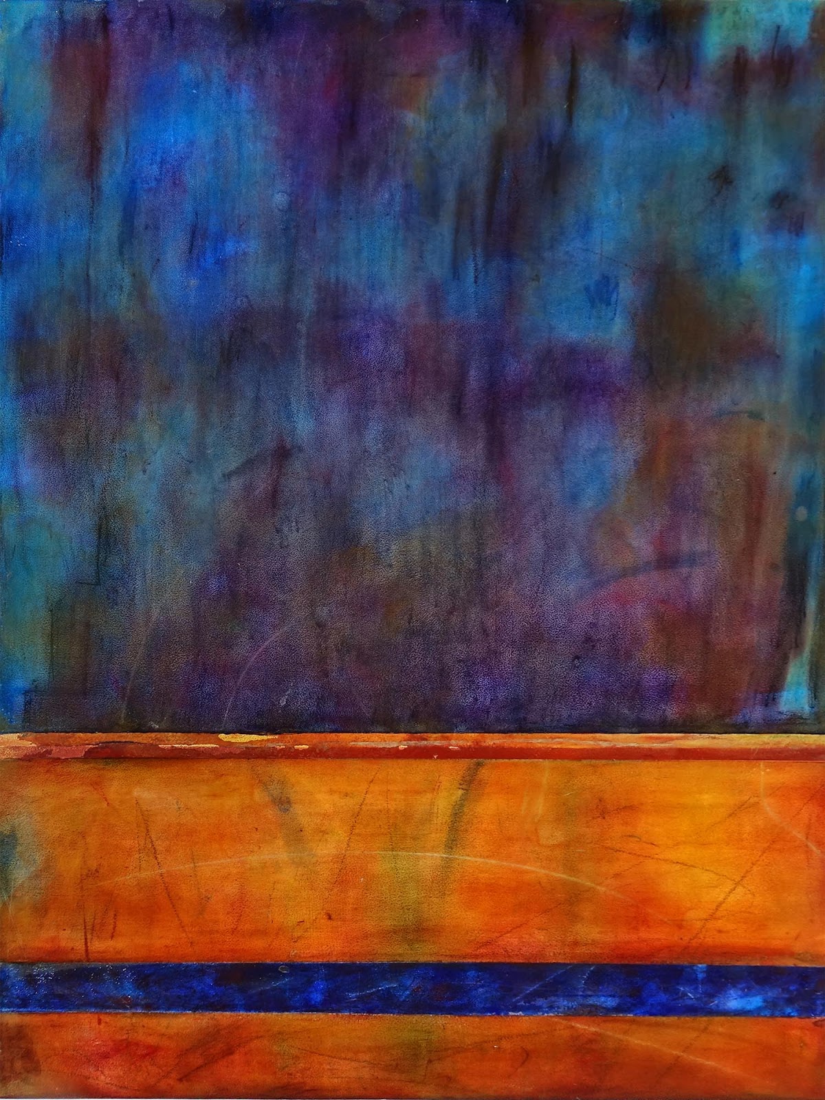
The old wall background is mostly dirty yellow and red ochres, with touches of purple, red and green pigments sprinkled in. I will use Pastels to draw a realistic baseboard and a window frame with a cast shadow. The images will be printed with a shadow to achieve the Trompe l'Oeil effect
I gave the panel three light coats of Golden Absorbent Ground to make it as white as possible for maximum contrast. I am using a different medium, but as with oils, I want the light to reflect back from the white ground through thin transparent layers of color. To me, it is what gives life to colors.
I may have to acquire a few of my old favorite super lightfast Daniel Smithtransparent oil colors in pigment form, like Anthraquinoid Red and Naphtamide Maroon.
First, I taped out the window frame and the baseboard and roughed them in with pigments and pastels. I then taped over them with the Yellow Delicate tape. I will almost completely finish the wall before I do these. as I want a clear line, and fusing would blurt too much.
I started roughing in the wall rubbing pigments in with my fingers and removing the excess with a wide brush.
I use a watercolor palette to put pigments in, and wear a dust mask for safety when working with pigments on large areas. The first 12" x 12" test is in the background:
I will later use my full set of Rembrandt Soft Pastels to add details, lines, spots, etc...
There is something a little nostalgic here,and significant as well, as this is how I started painting back in the late 70's. I have gone full circle over the last 40 years, and am back somewhere near where I started, except for the wax layer the addition of colored medium, the sprinkling of pigments, the fusing, and the scraping.
I have often said that the hardest thing to know for an Artist is when to stop. How many times have I flipped through pages of books giving a step by step painting lesson, and decided that step 8 was much better than the final result... In fact, it is always almost the case.
But then again, my purpose here is testing and learning the technique. So I mixed pale shades of five different blues and purple in medium, and applied them at random with a palette knife, troweling one color into another and layering them on top of each other. I ended up with a pretty thick crusty layer, onto which I sprinkled pigments of all the colors I had used , plus specks and spots of brighter purple, deep Lacquer Red, Mayan Green and even some Bright Orange.
I proceeded to fuse with the blow gun on hight heat, and after cooling I scraped the wax back smooth and thin enough to show the transparencies.The picture actually does not do justice to the subtle variety and depth of colors.
I am not sure I like it BETTER than what I had before, but the colors are rich and glowing. It doesn't look anything like what I planned either, but then I probably should get used to that, as both the wax and the Artist take a life of their own, and the mock up is just a starting point anyhow. The point is to end up with something I like, rather than reproducing the original concept.
Before I play any more with this panel, I think I am going to start on "Trompe l'Oeil Window", and tackle it full size. I don't expect the ochres to be as difficult as the deep blues.
I guess that big 4ft x 6ft panel scared me a little, so I built a quarter size one to do a study for the final painting. It will allow me to hopefully figure out how to get these wonderfully rich and glowing Blue, Purplish and Caput Mortum tones.
I made a mock up of the background alone, since it has to be nearly completed before I incorporate the images. I can't print them right now anyway because my old Epson R1800 is totally clogged up. I am going to have to get a new Archival Printer, and am looking at the new Epson P800, which is getting great reviews everywhere, and is sold with a $300 rebate until December 31. And it is a 17" printer, the R1800 was only a 13".

I want the horizontal stripes to stay sharp, so I taped them off, worked the colors with pigments and pastels, and put a layer of clear medium on top. I figured out quickly that if the pigment layer was too thick, it would not incorporate into the fused wax. I also realized that colors got a lot darker when covered with medium. So I am now keeping the color layer thin by brushing off the excess with a soft Hake Brush, and am keeping my colors much lighter. I want to be able to build up a layer of blue and dark purples with touches of different tones of lightly colored transparent wax that will run into each other in fusing, hopefully creating interesting color variations...
I covered my wax stripes with tape, and am now working on the marron bottom area, starting with yellow ochre and red ochres. Finally, with the rest taped off and covered in paper, I did the large blue area at the top with mostly Ultramarine Blues and Purples and Mayan Purple.
After brushing on a layer of clear medium, I scraped it back as thin and smooth as possible, and polished it with paper towels:
It still a long way from what I am trying to do, but it's actually pretty nice.
I almost hate to mess it up piling more wax on!
Two panels have been in deep freeze at 2°F overnight. I took them out and threw them on the tile floor hard, and again and again, harder and harder. I then smacked them as hard as I could on the top of the work bench, over and over, till my hands hurt and the panels themselves split.
NOTHING CAME LOOSE, I PASSED THE FREEZER TEST, ALLELUIA!
The first panel was masonite primed with Golden Absorbent Acrylic Gesso, one strip rubbed with blue pigment and coated with medium, 3 strips painted with Red Yellow and Ochre tinted medium and scraped back thin and smooth(no milkiness). Some areas were thicker than others, some were fused, some not.
The second was the basic white primed (I assume acrylic based) Plywood Underlayment sanded smooth, partly lightly, partly very heavily(almost down to the wood. Half of the panel was primed with Holly Grail Gesso. I then rubbed in pigments of different colors, coated the whole thing with medium, and fused it.
The other unprimed side was sanded smooth to remove the black cross cut marks and primed with Holly Grail Gesso. Two stripes were rubbed with Ultramarine blue pigment and shaded from dark to light using the white powder of the gesso, coated with medium and scraped back. One was fused, the other not. The middle stripe is just clear medium on gesso, the right half fused, the left not, and scraped smooth. The last stripe is Red Ochre colored medium scraped back very thin in places to show the background in transparency.
So it would seem that some people may be worrying excessively about adhesion. As I said before, from my experience, wax sticks to damn nearly EVERYTHING.
Nothing came loose AT ALL, so it would seem it doesn't matter that much after all which Gesso is used, and that even the Primed Underlayment Plywood is fine once sanded smooth and given a tooth. Even fusing doesn't seem to matter either, even with the chalky Holly Grail Primer.
Now, the reasons for my successful "Freezer Test" may be due in part to the technique I use of scraping the wax back thin and smooth, and in the process putting enormous pressure that improves adhesion to the substrate. The test may have failed had I built up numerous layers of medium, grooved and filled, etc...
But for what I am planning to do, I think I am going to quit worrying, stop all that preliminary testing, and go to work on an actual panel. Before tackling a big 4ft x 6ft , I will do a small 24" x36' version of "MUG SHOTS" on a sanded underlayment plywood panel double primed with thinned(to minimize brush marks) Golden Absorbent Acrylic Gesso and sanded very smooth:
It occurred to me the other day that the Holly Grail Gesso had to use as a binder either Wheat Paste, Gum Arabic, Casein, or Methyl Cellulose, and that rather than rubbing pigments in the ground, I could possibly mix them into paint with one of these four traditional binders. It seemed worth testing the idea, and I already had Wheat Paste for Book Binding, so I ordered Gum Arabic and Casein.
I used a board primed with Holly Grail Gesso and Ultramarine pigment for the test, mixing it with increasing amounts of water and Wheat Paste, Gum Arabic and Casein(left to right).
The Wheat Paste was a little lumpy, and looks grainy, with heavy brush marks .
The gum Arabic went on smooth and adhered well, but adhesion decreased as the dilution increased, and it tended to pool and leave gaps in the coverage(a little Ox Gall helped). The white from the gesso did not seem to mix with the paint, and the colors are rich.
The casein has a white milky color to start with, and produced much lighter very flat colors with excellent coverage. It was made even worse by mixing with the white pigment in the gesso when over brushed. I don't like it, it kills the colors, and pastel tones are not my thing.
I also made swatches of different colors of Rembrandt Soft Pastels(left side), first rubbing the stick on , then smoothing and rubbing hard with my finger. The pastels definitely produced the most intense opaque color and very good adhesion to the board, without getting a chalk look from the white gesso particules, I assume because of the binder in the pastel sticks.
I had started with a swatch of pure Bluempigment rubbed into the gesso(top left), and found the coverage was uneven. The more I rubbed, the worse it got. I had used an Ultramarine Blue from Earth Pigments, which was cheaper than the Sinopia Ultramarine Blues, so I made a side by side test swatches on the bottom, and the basic rule "You get what you pay for" applies here as it does most of the time. The Sinopia Ultramarine produces a richer color with very even coverage, which does'nt seem to degrade with rubbing. That makes me wonder if the swatches with binder would have come out better too.
The lessons are:
1. Binders don't seem to help, so I will use a combination of rubbed raw pigments and pastels for my underpainting.
2. DO NOT SKIMP on pigments, Sinopia's products are definitely better. Plus they tell you precisely the properties and have a much wider range of colors.
Well, over in over in the tutorials and books about encaustics, I have heard and read warnings about using the proper ground, lest the wax fall off.
I have not done encaustics before, but I have worked with wax a great deal in sculpture and relief, both microcrystalline and beeswax, and my experience has been that hot melted wax sticks to damn near ANYTHING. I have scraped it from wood, stone, formica,white slick tailboard, masonite, glass, plastic, paint, metal, etc... In fact, when I was making models for lost wax casting of bronzes, the only way I found to keep them from sticking to my work bench was to rub the surface of the bench with mineral oil. It still stuck, but that made it a lot easier to scrape off.
That said, I believe in listening to experienced people and learning a new craft from them as much as I can. So I dutifully read the instructions from various source to make a rabbit skin glue and other special grounds. The people at Enkaustikos are particularly vehement about NOT using Acrylic Gesso(click on image below), and use "the freezer test":
"R &F Encaustics" worked with Ampersand to develop and sell their own Archival "Encausticbord". But the panels are too small and expensive for my project.
"Evans Encaustics" claims the best ground is their own non acrylic "Holly Grail Gesso" , and offer it in a range of wonderful colors that could be used for underpainting, which is an idea I like, eliminating one step in the process. So I ordered a quart of white Holly Grail Gesso, and have been using it on small masonite panels for my "Learning Experiments". The gesso goes on very smoothly with a wide camel hair brush, and is loaded with pigments, so it covers well, and dries fairly quickly.
What I found a little strange though was that it was very chalky, and came off on my fingers if rubbed, even lightly. Sanding it lightly would practically remove it completely, and I just used a paper towel to smooth the light brush marks.
I had by then received a good selection of pigments, and decided to do a color chart with pigments mixed in medium, and scrape each stripe from thick to very thin to judge the transparency(I hate solid opaque colors):
I had not fused the medium, and noticed thin areas tended to break off.
I like to start an underpainting directly by rubbing pigments in the ground and drawing with pencils and pastels, and the results were very smooth and good looking, allowing smooth gradations of tones(2 bottom strips):
But when I rubbed in the Ultramarine Blue pigment, it mixed with the white powdery gesso ground, and I could never achieve the full pigment color intensity, as I could on a panel primed with the alternative "Golden Absorbent Ground"(top strip). Not really a big problem, especially since the Golden Product doesn't cover the brown Masonite as well, leaves heavy brush marks, and would need to be sanded and applied in at least two coats, which means more time and money preparing the panels.
I also like to scrape the medium back to a very thin layer. The bottom strip, which was fused before scraping held up really well, but the middle strip which was NOT fused tended to pull off when the medium became thin. The top strip done on Golden Ground held up well without being fused, especially the area I had sanded smooth on the right.
Just to see, I dropped some molten medium on both boards and let it harden:
The drop on the Golden Absorbent Gesso (right) could not be pried off, but the drop on the Holly Grail Gesso popped right up with the layer of gesso. Not so good. There definitely has to be heavy fusing when using the later for the medium to stick properly, and that worries me. So I wondered why bother, when it seems to stick better to the Golden Acrylic Gesso, which according to Enkaustikos is an absolute NO NO? Time I suppose for a "Freezer Test"!
I left both the Golden and the Holly Grail primed boards in the freezer overnight.
After a day of drying, which I spent sorting old papers and cleaning up, one last thick coat of Teak Oil did the job, and after letting it soak in about 30 mn, I wiped it off with paper towels and polished it with a rag. The result: a 49.5" x 171" table, and brighter lights than I ever envisioned. I started assembling the 4ft x 6 ft panel for my first serious piece, using primed 1x4's and 1/4" Sureply Plywood Underlayment.
It is a High Quality Premium "Green" Birch Plywood which has a white priming on one side and a Lifetime Warranty. The sheets are very flat and smooth on both sides, better than the more expensive standard Birch Plywood.
I am building this panel 4" thick because it has a 17" x 25" window like recessed area, and a "floating" back panel:
I am also building a standard 4ft x 6ft panel using primed 1x2's made of hardboard. I am switching to these because they don't warp like real wood, and the plywood either.
The only issue is the priming of the plywood, which I am going to have to mostly sand off to replace with the special ground.
I wanted to start working on larger pieces, which meant I needed a large work table. So after I cleared my desk entirely and moved all the computer equipment back where it used to be in the large African Cabinet, I retrieved two old sheets of plywood from storage, and screwed them down on top of the desk/library table, and bought two sheets of masonite to cover the surface. I suppose I could have started working right there and then, but the edges looked really rough, and I thought I would make it a finished permanent huge Desk/Worktable and try to make the whole studio look better, and more organized.
So I got some very smooth poplar 1x2 strips, and fitted them around the edges with mitered corners, flush with the top of the masonite. I sanded them smooth and stained them Dark Walnut. I chose to finish both the wood and the masonite with Teak Oil, which is supposed to soak in, impregnate the wood and harden, leaving a tough surface. The problem is that so far, the masonite has soaked up 2 quarts of oil, and still seems to want more... I am letting it dry a few days before attempting a second coat.
In the meantime, when the weather went from sunny bright to gray and rainy, I realized I would need some lighting above the table on dark days. It just happened that I noticed at Lowes some Utilitek Pro 4 ft LED flush mount Ceiling Fixtures :
They burn little power(37w), are quite bright at 3200 lumens, and are supposed to last a very long time. They are also much better looking than fluorescent fixtures and well finished, made of smooth wrap around Anodized Aluminum. The light quality is also much better, pretty close to daylight.
I bought three, and mounted them to a pair of aluminum 1" square tubes, so I could hang them down from my 20 ft ceiling as a single neat strip.