Friday, November 25, 2016

Post 20: Trying to improve a Test

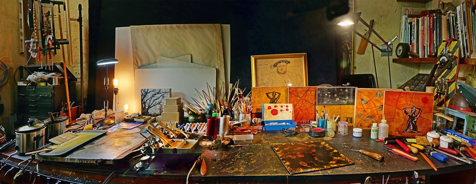
    I incorporated six left over images printed on Japanese Paper into the Yellow Background with a Grid Panel, fused them in, built up the clear medium over the images, and scraped it back as smooth as possible. This is something I am actually still learning to do, and getting a slick surface is not easy. My old 1.25" scraper always seems to leave scratches and low spots. I don't mind having some, that I can fill with the oil sticks, but am trying to get more control over the process and master the scraping task.
   I found that one has to use very smooth strokes with a fair amount of pressure, and the gradual start and finish are critical. One has to keep rotating the panel and buffing it often to see the bad areas.
   I went on an Internet search for a wider scraper, and found that Kemper makes a 2" Scraper Tool. I had a hard time locating one though, as it seems to have been discontinued. Finally found a place called New Mexico Clay that had 3 in stock,  and ordered all 3 of them:


     In the meantime, I ended up with this when I incorporated 6 left over images on Japanese Paper. They actually worked pretty well because there were no really dark areas on that panel. They just got a yellow cast. But I am not happy with the way the panel looks, and need to figure out what more to do with it to tie things together and make it work:


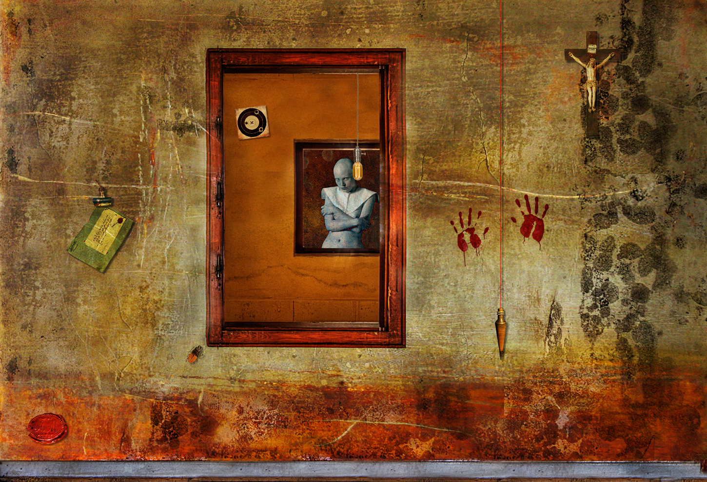
     So I used Photoshop to experiment a little and came up with a mockup of an idea I like, using a red string actually "tying the images together", running through small holes in the panel. Then I added a hanging seal with the braided string also attached through holes:


    But before threading the string, I thought I would apply a Red Patina with an Alizarin Crimson Oil Stick. Also, it seemed that the images needed to be visually bound, and I used the modified Pouncing Wheel to run dotted lines following the outside lines of the grid. 
      I rubbed the oil stick well into the holes and scratches, and used my gloved finger to spread the pigmented oil over the entire panel. Alizarin Crimson has a wonderful rich transparent glow:


      I wiped most of the Red oil paint off with paper towels, being careful to leave enough in the scraped wax surface scratches and holes, and a thin film around the edges:


      In a few hours, the oil was actually dry enough to drill the holes and weave the red string through. I used 6 cords of 3 different colors plaided together to make the cord to hang wax seal.


      I felt the big 2" seal was too big for such a small painting, but the 3/4" were not big enough. The only choice offered is a 1 1/8" wax seal, so I redesigned its Artwork eliminating the inner ring of text, and ordered it made to use as a signature on smaller pieces:


Wednesday, November 23, 2016

Post 19: Expanding and Refining my Color Palette

   I like the natural earth colors I already have, and they will probably be much used in future paintings, but I want to expand and refine my choices as far as Reds, Blues, Greens and Purples. So I went back looking at a few suppliers, which interestingly enough seem to carry different ranges of pigments. I finally settled on SINOPIA PIGMENTS, and placed an order for 9 reasonably prices pigments: 


thumbnail imageDC7300/75 DC7300 Cadmium Orange Deep
weight: 75g jar
$18.00 x 1 
$18.00

thumbnail imageDC1100/75 DC1100 Cadmium Yellow Medium
weight: 75g jar
$16.00 x 1 
$16.00

thumbnail imageDG133/75 DG133 Chrome Oxide Green Opaque
weight: 75g jar
$9.00 x 1 
$9.00

thumbnail imageDC90C/75 DC90C Ultramarine Red, antique pink
weight: 75g jar
$11.00 x 1 
$11.00

thumbnail image799G1001A/50 799G1001A Mayan Green Pigment
weight: 50g jar
$9.00 x 1 
$9.00

thumbnail imageDCV8/75 DCV8 Ultramarine Violet, Reddish Light
weight: 75g jar
$11.00 x 1 
$11.00

thumbnail imageDCF36/75 DCF36 Ultramarine Blue, reddish
weight: 75g jar
$9.00 x 1 
$9.00

thumbnail imageDCFG75/75 DCFG75 Ultramarine Blue, greenish light
weight: 75g jar
$9.00 x 1 
$9.00

thumbnail image799V1000/50 799V1000 Mayan Violet Pigment
weight: 50g jar
$9.00 x 1 
$9.00
  
     I am of course going to keep mixing pigments in the Encaustic Medium, but I have discovered that simply sprinkling pigments on the wax and fusing can create just the kinds of visual textures I like, with fine detail, lines and specks. A lot of pigments are very dark in their natural form, and need to be mixed in a medium for the color to show. So I paid particular attention to the more brightly colored pigments that still have good tinting strength, so they can serve both purposes.
     Of course, I would love to use the more exotic rare pigments such as Cinnabar, Azurite, Malachite, Lapis, but at $30 for 10 or 20g... 
     I was intrigued with the collection of Mayan pigments, and ordered the violet to test, as they seem to have mostly very poor tinting strength.

Post 18: Another Panel turns out Pretty good

   After scraping the clear medium buildup over the images down and getting the whole surface of the panel as smooth and even as I could, I polished  wax with paper towels. Then I rubbed the Alizarin Crimson oil stick all over the surface, and worked it into every scratch and pit in the surface, before wiping most of it off with paper towels. 
   Finally, I applied the three good luck Chinese signs Wax Seals, and my own large Signature Seal, using traditional Red Seal Wax:

  
   I know most people won't care about the subject matter, that magnificent 19th Century British Wax Ecorché by Joseph Towne, but I do. Besides, I like the feel and look of the piece, the colors, the visual Texture, the repetition of the Seals.
    I believe I am beginning to come up with a distinctive look.

Monday, November 21, 2016

Post 17: More Experiments and Tests

    One thing I have learned so far is when you work with encaustics, it's a good idea to work on several panels at the same time.
    I was at Michael's yesterday, and picked up a 12"x12" plywood panel for half price to compare to the masonite. I am thinking birch plywood my be archivaly better than Masonite, and provide better adhesion of the wax medium as well. Also, obviously, the birch plywood is very light in color compared to the masonite, and I wondered if I might skip the priming, which will be a pretty expensive and time consuming thing on big panels.
    So I sanded the panel smooth, and rubbed dry earth pigments from a Sample Box I bough in Provence at the ochre quarries of Roussillon many years ago, directly into the grain of the plywood, in shades of ochre, and finished with touches of black and a red ochre dot. I lightly blew the excess pigment off the board, which left plenty of color. Then I covered the panel with several coats of clear medium, and after cooling started scraping the wax back down to a thing slick layer. I am not crazy at all about the way the grain of the plywood ends up showing  through. I suppose that means a layer of Gesso  is going to be necessary to fill the grain, and if I do that, I might just as well consider doing the "underpainting" with colored gesso instead of pigments.


     Another thing I have figured out by now is that I like purely visual textures better than actual rough textures. It is good to lay the medium on roughly with short brushstrokes in all directions, but I always seem to end up scraping the wax back down to a smooth layer as even as possible, and polished to a high gloss, which brings out the details in the visual texture. I suspect this will become a hallmark of my work in encaustics, even though, or may be perhaps because it goes "against the grain" of the medium.
    At the same time, I added a couple of images to a background I had just created. First, I rolled them on hard, then I heated the panel to soften the wax a little so the images could be pushed down further into the surface with the roller. I burnished the edges down. Then I built up a surface of clear medium over the images alone, feathering it out. I will scrape it back smooth and even:


Wednesday, November 16, 2016

Post 16: And the Winner is...

    It is amazing to me how quickly things can change when working with encaustics. Every time one fuses a layer, there is an almost magic moment when one has to relinquish control, let the melted wax flow, colors mix, and the whole surface rearrange itself into something hopefully more beautiful that what one had before... Sometimes, it doesn't happen, but there is no going back. However, one quickly learns that there is always a way forward. A scraper can reveal patterns of unexpected beauty, and there is always the option of rubbing oil in cracks and pits, sprinkling or rubbing in dry pigments, burning shellac, adding more colored medium with loaded or dry brushes. It's messy:


    I usually place the panel on the "Shabat Tray" when I do that to warm it, so I can do longer smoother strokes with a loaded brush an lay down thinner laters of medium. One has to be careful not to heat the panel too much, lest the wax on it starts melting. But then, happy accidents happen, and you can achieve in this way a sort of "reverse fusing", where the bottom layers melt first. 
   I worked on my two panels side by side at the same time, and got them both to a point I liked them, similar in many ways, but yet quite different. 
   The next step was to lay down the four printed images: the plumb line, the envelope, the crucifix, and the Agnus Dei. The images printed on thin Sumi Paper easily stuck to the medium, the thicker ones printer on Epson Matte paper were more of a challenge. I used brayers to push them down into the wax, I used a burnisher around the edges. Finally, I warmed the panel to slightly to soften the wax, covered it with wax paper, and put a lot of pressure with a hard rubber brayer to force the images into the surface as much as possible.
     I brushed a light coat of clear medium just over the images, and the Japanese paper literally melted in and blended nicely into the background. It took several coats to blend in the thicker Epson Paper.
     I fused the images, and things looked pretty good, except for some cloudiness over the images, which I carefully scraped out. I probably should have left things alone at this point.
     But instead, I got the idea of dry brushing some transparent yellow ochre medium around the top and some red ochre along the bottom of the wall. After fusing, the panel with the thin images looked rather good, but the other showed excessive buildup and cloudiness. So I scraped it back down. I went too far, and had to add some clear medium over the images, scraped some more, touched up, rubbed oil paint and wiped it, etc... I ended up reworking the one that I thought pretty good too.
    Anyhow, after messing with them a while more this morning, I thought I would stop and look at them for a while.  So here is the one with the Japanese Paper Prints:


    And here is the one with the thicker and brighter Epson Paper Prints:


      I am not sure at this time which one wins. The Trompe l'Oeil effect is stronger in the latter, but I like the former too...
      But I am pretty sure I've got something going there, and am ready to try to go for the "Real Thing".
      Before I can do that however, I have to completely re arrange my long "desk", which means finding a place to put all that stuff!


Post 15: Practice for the First "Serious" Painting

    Practice is fun enough, and I obviously need a lot more of it before I have tried all the available techniques techniques, and figure out which to use for a particular painting, and in what order. There is a certain amount of unpredictability built in the medium, and one often have to go with the flow, exploit an accident, and end up with something different from what they intended
     That works well for abstract work, but I am planning to do semi realistic Photo Encaustics from mockups designed in Photoshop, so I need a certain amount of control. I will probably have to do a small experimental panel for each larger piece to determine the best way to proceed in order to achieve a particular color and texture.
      And this is what is at hand today. I want my first big "serious" 48"x72" painting to be "Trompe l'Oeil Window":


    I have just begun a small panel that will be a test, and hopefully guide me to achieve something close, and as good or better than the Mockup.  It doesn't look too bad for a start, with just pigments rubbed in the paper, and a couple of layers of fused medium:

   
   The final Piece will definitely be different, since I have lost the total control of Oil Painting. But then, the various textures I layered and manipulated in Photoshop are just that,textures, and I have no need to match them exactly, as long as the wall comes out looking like an old grimy wall. 
     I put together a group of images on a 8"x10" background to use for testing, including the letter, the crucifix, and the plumb line, all with drop shadows:

    I printed it as a baseline test on my familiar Epson  Ultra Premium Presentation Paper Matte. It looked great. I then cut and taped a piece of Japanese Calligraphy Sumi paper to sheet a plain paper, so it wouldn't get jammed and torn in the printer, and printed the same image on the glossy side of the Sumi paper. I was quite amazed at how well it came out. Granted, there is a little less contrast and saturation, but that could easily be compensated for with a curve. I photographed them side by side:


    My original intention was to use the Japanese paper because it is so thin it literally disappear into the wax. But in the process, it becomes transparent, and the background will show through the very light areas where there is little ink. That was not a problem with the stylized Solarized Inverted mostly black nude image, but it will be with these. If I want the images to look real enough for a Trompe l'Oeil effect, I will have to print them on a paper that doesn't become transparent at all. I will have to test the Epson Matte for that.
    The images will have to be perfectly cut out, but I am afraid a hard edge drop shadow might look unrealistic. I may have to paint them with oils.
   Also, the images obviously will have to go on last,  and be literally embedded in fairly soft wax with a  brayer, before they are barely covered by a thin layer of highly buffed very transparent medium. Evans Encaustic offers a High Shine Top Coat that might be appropriate.  
    That means that all the wall texture, encaustic and oil work will need to be done first.
     I cut out all the images, using scissors, x-Acto knives, and small snap blade cutters. Scissors produce the smoother curves and the thinest edge. Cutters are the worst, raising a sort of burr that has to be burnished. The thinner X-Acto blade is somewhere in between. 
   When placed on a light ochre panel and rubbed on the wax, the Sumi prints look definitely darker and duller than the Epson Matte paper, but show more texture, and are less"in your face". Of course, the Epson prints could be made darker:


    I placed the two side by side on the WALL TEST 1 PANEL, and can't really decide which I like best:


    So I made a second almost identical Test Panel on a piece of Masonite primed with two coats of Golden Absorbent Ground, rubbing yellow ochre, red ochre, and black pigments on with my fingers:


    The texture is very different from paper, as the brush marks are quite sharp, even though I used a very soft big goat hair brush, so the result is rather different, but not so much once it is covered with two coats of clear medium and buffed:


     Well, now is the real test, one panel with the Sumi Prints, the other with the Epson Prints, after doing some texture work scraping, scribbling, adding colored medium, rubbing oil in pits and scratches, sprinkling and rubbing dry pigments into the wax, and fusing multiple times.


Tuesday, November 15, 2016

Post 14: Old Kufic Arabic script

   For many years now, I have been interested in calligraphy, fonts, and the amazing varieties of Alphabets and Ideograms man created in different parts of the world over millennia. I have collected many old documents and manuscripts from all parts of the world: Phoenician, Aramaic, Arabic, Persian, Hebrew scripts in the Middle East; Coptic, Egyptian, Adrinka, Tifinagh, Tsibidi and more scripts in Africa, the numerous Bramic scripts of India, Burmese, Chinese, Japanese, Korean, and on and on...
  The various Arabic scripts have become an Art Form: 
  
    Of course, I also like Runes and Ancient Symbols, including the Swastikas and backwards Sauwastikas that I saw drawn with cow dung all over Hindu Temples in India.


    I find most of the old Scripts much more beautiful than our Modern Western script, and since I don't know what they mean, letters and words are like Pure Artwork. 
    In this new project, I would like to include some of    these as a reminder of our diversity, our ingenuity, and as a "hidden message". There are words that particularly matter to me, having to do with life, values, good vibes, but I don't like to use our western words in a painting. I find that too obvious. I don't want people to be able to read them, so I want to scatter these words in scripts and symbols very few of us recognize all throughout the paintings, as a kind of "subliminal message" that is also graphic, beautiful, and an integral part of the fabric of the overall painting. 
     For some reason, I started surfing the web yesterday looking at the old Kufic Arabic script, the simplicity of which really appeals to me, and was especially struck at the ressemblance betweeen 21st Century QR codes and 7th Century Square Kufic words:


       I thought it would be interesting to include both in all paintings, the former explaining the latter. I could also of course include more info about the painting, a bio, links to my site and blogs, etc...

Post 13: More Test Panels

    When I realized paper was not a good background glued to masonite panels because it buckled and curled when wetted or heated, the only other option was to use Gesso. R&F makes a special Gesso for encaustic that is porous  enough to accept the wax, but it is very expensive. Evans Encaustic in Atlanta makes one that is cheaper, and has the advantage of coming in several beautiful colors. I also ordered the Absorbent Ground made by Golden. 
   I primed some panels with both yesterday using a wide soft Goat hair brush. The Evans Holly Grail Gesso seems to cover better with two coats than the Golden, and dries smoother, with less brush marks. It also seems more matte, the Golden has a slight sheen. It is too soft when freshly dry to be sanded between coats, but seems to harden overnight. I will definitely try the colored Holly Grail when I start doing larger pieces.
    I still have two panels covered in paper started last week before I had the gesso. For the first one, I wet the watercolor paper and did a yellow ochre background with touches of brown, red and green, and used tooth brushes to speckle it. Then I drew a grid with a Prismacolor sienna pencil, and covered it with two coats of medium which I fused:


      The other panel is a test for the projected three dimensional "Trompe l'Oil Window" I did a mockup of a couple of weeks ago:


     Before I incorporate the photographs printed on tissue paper, I have to create the illusion of an old stained, scratched and grimy plaster wall with a baseboard and a window frame. I am not sure at this point whether they will be wood molding or Trompe l'Oeil". 
     I taped out the baseboard and used ochre and black pigments to color the paper. I removed the tape and dirtied the baseboard,  then brushed clear medium on from all directions to create a lot of uneven texture, and fused it. That looks like a pretty good start once buffed:


Saturday, November 12, 2016

Post 12: Testing a Black panel with Grooves

   I thought I might well mess up this one up the first time, so I just used a piece or masonite covered with white paper, which I stained yellow by rubbing pigment on. I should have started with yellow paper. I put on a clear coat of medium, and then stippled about three irregular coats of medium tinted in different shades of ochre, which I fused and scraped. I was surprised at just how much wax I used.
     I melted more medium to mix a big batch of black, and made the mistake of putting the hot crockpot liner down on top of the panel, which melted the wax and created a donut shaped hole... So I just filled it up with red and yellow ochre medium, scraped off the excess, and stained the middle red with oils. I also rubbed on some white, red and marron oil paint from tubes and wiped most of it off. After fusing, it actually looked pretty go, so I stopped to think and took some pictures :


    The layering, rubbing, scraping, fusing, and buffing actually creates really interesting fine textures and brilliant colors:


    I considered keeping the panel and starting over, but finally decided to go on with it, and put down irregular swatches of a dark maroon in the middle and ochre around the edges,  which I fused. Over that went a thin even layer of yellow ochre, and finally a  layer of black medium, leaving some pits showing the yellow. 

     I was very careful scraping back the black, and very slowly removed very thin slices of wax, constantly turning the board around to change the scraping angle, and trying my best not to cut any grooves. I found that covering the blade with a thin layer of mineral oil  will keep the scraper clean and
avoid the shavings getting stuck on the surface.


    Once the panel was smooth, I kept on shaving the black wax thinner and thinner until it became translucent, and some of the ochre and maroon grounds below showed in places, especially around the edges. I tried to leave the surface as smooth as possible and polished the panel with paper towels:


     I think fusing and scraping again is an option, and might yield interesting results, but what I have is pretty nice, and I am ready to cut grooves into the surface, both straight and curved. There will be no correction possible, so I think I am going to do a mockup in Photoshop to get an idea of what it might look like before I start...


     It will be hard to do without French Curves templates. I suppose I could cut my own, but I already have some on order. I will try to manage with the compass. For the straight grooves, I tried the narrow Lino Cutting Gouge, but it raised a substantial burr, and I switched to a very small scraping loop which I squeezed with pliers to make it even narrower.

      I worked on the grid first with a ruler and that tool. It turned out my layer of black wax was way too thick, and the grooves had to be very deep to reach the yellow layer. I had to cut through the wax many times, and the grooves ended up too wide, with quite a burr. I cut the helical groove by hand with the Lino Cutter, and as expected, it didn't turn out very smooth. I will definitely use French Curves Guides next time.
      I ended up with this, which was way too messy looking, with the grooves too deep, too wide, and a rough  helical curve:


     I had no choice but try and fill the grooves with medium in shades of  ochre.

     Before I started, I use a wheel to score dotted lines.
     The whole panel ended up covered in yellow medium, and it took a lot of careful scraping to get it down to a thin covering of transparent yellow medium over the black wax. I am almost there, I can see the black burr lines :


     I rubbed some mineral oil on the panel so the high, lows and hazy areas would show better, and carefully shaved the rest of the yellow wax layer off, revealing the pure black background.


      The final result is a long way from what I had in mind, and   I don't really like it very much: too much yellow, not enough black, too bold, too garish, lines way too wide, uneven helical curve, etc... But I learned a lot doing it:
     1. There is no need to waste expensive medium building thick layers. A thin layer of ochres topped with a thin black layer would have worked better, and allowed much narrower grooves. In order to lay down a thinner layer, the panel has to be heated, and the wax on the brush kept hot and liquid using the heat gun with the left hand. Wider brushes make things easier, and with the 6" Hake Brush, it only takes two strokes to cover a 12" panel:


    2. The colors are too bright, I need to mix more subdued tones.
     3. The helical lines cut by hand are not smooth. I need to use French Curvest to draw the curved lines. I now have a  small 12" set, but I need a set of 24", and for large paintings, I will need to make my own out of masonite.
     4. The yellow areas are bigger in relation to the the black background than they were before I added the lines because of the extra scraping. I need to keep that in mind next time.
     5. The intersection of 3 lines may be messy, so I need to plan better and avoid them.
     6. I like the dotted lines done with the 4mm wheel a lot, so to vary the lines, so I ordered a set of three smaller Excel Blades pounce wheels: