Wednesday, March 27, 2019

Post 57: The lot of 18 left to finish designing

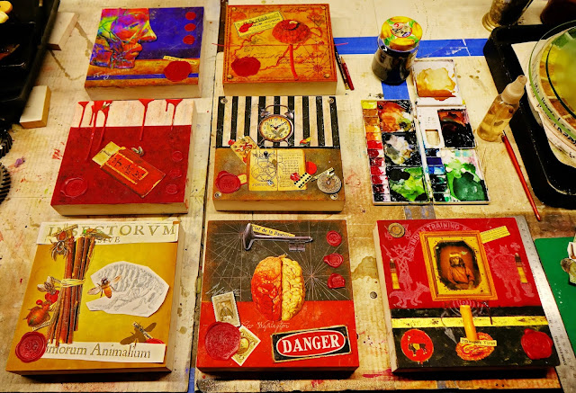
    I grouped together all the remaining unfinished designs from that big batch of 40, and came up with 18 panels. Some look promising and almost finish, while others still need a lot of work:


     I cut the set into individual pieces, and will start with my favorites. The working title for the first one is "Antique Coke". This is what I have at this point, let's get to work and make it special:


Post 56: Finally making a couple of pieces that were designed back in the Fall...

      I have a couple of pieces already designed with the last batch which I am going to get started on, while I finish designing in Photoshop those of the 40 I started with which were left alone for a few months.
      One is pretty elaborate, and I will do it in a larger 12"x12"size. It's working title is "Relics", and I do like it a lot. I am sure I will find a better title by the time it's finished:


        The other one, which I will call "House Keys", is a bit simpler, and will make a good 8"x8" panel:


Tuesday, March 26, 2019

Post 54: Sixteen Panels Finished at Last, and Sold Within a Week!

   The panels had been languishing unfinished in the studio for months while I was trying to reorganize the studio so it looked better, and find storage space for all my stuff.
   But Rachel was having a big Estate/Decorator Sale last week end, and I thought I would put my work out for sale, not really thinking I had much of a chance.
   So I went ahead and finished the eight 8"x8" panels that were already waxed, coating the edges with black encaustic and polishing them after a night in the fridge (one gets a higher shine when the encaustic is cold, because more pressure can be applied to the shop towel):


    Then I coated the eight 10'x10" panels with clear encaustic, the sides with black, and gave them a polish the next day:


    Some kept their working titles, a few got new titles, and I priced them as low as possible: $125 for the smaller ones, and $160 for the larger ones.

    And amazingly enough, 15 of them had sold within a few days

Thursday, November 8, 2018

Post 53: Back to working on the Second Row

      The 8"x8" series of  nine panels seems a little small. It would not take any more time to make the same image a little bigger. So I ordered two packs of four 10"x10" wood panel from Amazon. At 6 bucks a piece, there is no way I will bother making them!
      I started finishing up the Second row of images, starting with this:


and ending up with this:


    I printed all the component images and background patterns, and started working on all 8 panel backgrounds with straight pigments, which I sprayed heavily with very diluted Gum Arabic to fix them. I find I can get particularly vivid colors this way.I laid some images on the panels to check that colors match:


      The most difficult will be the blue bird, because I want the image to melt into the background perfectly. The blue is about perfect, but the magenta on the botton needs a lot of adjustment.
      I will add a little more visual texture with pastels and spit, then spray again with the Gum Arabic solution.
     As I explained before, spitting does works well to texture backgrounds, and it's a way to put some of my DNA into the painting as an invisible signature. I like that.

Tuesday, October 16, 2018

Post 52: A Three Dimensional idea, for the "Temple of Wisdom"

    I was walking around the house  patio yesterday, and my eyes happened to fall on a "Dome Shape" sitting among the flowerpots. It immediately triggered the vision of some king of domed "Temple of Wisdom", something we are in dire need of in these troubled political times. It is made of fiberglass covered with a mosaic of perfectly fitted rows of thin stone squares. It was a vask used in a Greek style tripod bronze stand, but was dropped and broken. Our friend Mike salvaged it and roughly patched it, which I kinda like for the dome of a busted up, long abandonned and battered "Temple of Wisdom":


     It is 17.25" in diameter and 10" tall, which is a little odd, higher than half of a perfect sphere. It also immediately made me think of one of my favorite Architects ever: Claude Nicolas Ledoux
     With Etienne Louis Boullée and Jean-Jacques Lequeu, he is considered the main exponent of 18th century "Utopian Architecture" reflecting the "Revolutionary" ideals of "Liberté, Egalité, Fraternité".

      A Google search led me to a couple of watercolors by Lequeu for a "Temple de la Terre". The inscription above the door reads "A la Sagesse Suprême", which translates as " To Supreme Wisdom", exactly what we need the most:


    I also found a watercolor of a strange domed structure, a Folly I suppose:


     I can definitely already visualize a design combining all three concepts into one, using a stepped pedestal and columns all around the outside like the second, leaving peepholes around the base of the dome and door openings like the third, and using a background drawing of the globe on the outside of the dome like the first one. May be something along these lines:


     The cylindrical "wall" would bear drawings, words and images both on the outside and the inside(thus the peepholes and doors). LEDs would light the inside. I am wondering whether to also paint the inside of the dome itself... In this case, a mirrored "floor" would be needed to reflect it so it can be seen...
     It might end up looking something like this structurally, with added background drawings, and a lot of Grafitti:


      The wall of the temple is going to be cylindrical. However, I need to do the Encaustic work flat on the table. The only way I can think of doing this is to use two sheets of very thin wood veneer glued to a heavy paper backing(the same I used to make stained trompe l'oeil "wood frames". One will be the inside wall, the other the ouside wall. When finished, they will be rolled, and attached to wood studs coming out of the stepped base:


     In the meantime, I have spent hours researching "WISDOM", and sifting through thousands of "QUOTES" from all kinds of people from Antiquity to the present time. I favored short ones obviously, because they will become Grafitti, but also actually found that the shortests are usually the best. Wisdom should be distilled to its very essence, and it shouldn't take a thousand words to sum things up.
      I have long been a "Font Freak", and have a collection of thousands of unusual free fonts, including many "Grafitti Fonts". As I was collecting my favorite quotes, I copy/pasted them in Photoshop in different Grafitti Fonts to get an idea of how they would read:


Saturday, October 6, 2018

Post 51: Second Row Photoshop Mockups

   As it turns out, I like the 8 images on this row to try to finish all of them. All of them had basic colors and a few key images, but needed to be refined. My first concept for the 40 tiny 8" x8" panels was to keep them very simple, but it seems I am having a hard time doing that, perhaps because I am working on a 55" monitor, and look at 18" to 21"mockups, much larger than the 8"x8" panel size. But then I am happy with the result:


    Most of these would look good as 18"x18" panels, and in a way, all the detail is a bit "wasted" crammed in only 64 square inches. I want to do 2 more 8"x8" panels to bring the total to 9, so they can be displayed grouped as a 3x3 square, but the next one will be either 10"x10" or 12"x12".
     I will choose these two to execute right away in 8"x8", and finish them together with the 7 that are already almost finished:


Saturday, September 29, 2018

Post 50: Fourty "Tiny Squares" in the Works

   To make things easier, I cut the large image in 5 rows of 8 images, with plans to work on each row and complete it before going to the next, with the expectation that maybe 6 or 7 of the tentative images would lead to a finished piece.
    Starting with the first row, I began to refine the images. I was having a hard time with the last one, but the first seven came along nicely:


    At this stage, I dropped the last one, and split the row in seven separate images, each image sized 8"x8"at 300ppi. I started working on the 7 panels at the same time, primed with slightly thinned Golden Absorbent Ground (White). I use a couple of coats I sand lightly to even the surface, and finisg with a last coat applied with a 1" fine sponge roller that leaves an even fine texture that catches both straight pigment and pastel flat strokes nicely. I worked on all backgrounds simultaneously,  sprinkling pinches of different color pigments, rubbing them in with my fingers to a smooth finish covering part or all of each panel.
      I created textures with spitting, sprinkling or spraying very diluted gum Arabic on, tamping with hand and paper towels, sprinkling on more pigments, rubbing pastels on, scribbling with pastel pencils, rubbing with fingers, spattering with tooth brushes a mixture of water, pigment, Gum Arabic and a drop of Oxgall (basically watercolor), etc...
 

       When the basic backgrounds were done, I stated adding drawing and lettering in black and white pencil. After printing the various photographic images or groups of overlapping images (a basic trick of Trompe l'Oeil") with my Epson Archival Printer on my new very thin Matte Red River archival paper, I cut them out precisely, colored the edges with brush markers, started positioning them according to the Photoshop mockups, and moving them around to my satisfaction. At this point, no image is attached to the panels:


     Little by little, things get tried, changed, moved, adjusted, and the images are attached to the panels with very slightly thinned Archival YES paste. The wax seals are loose, and no encaustic has been applied yet. The shadows that will create the depth and the Trompe l'Oeil effects have not even been drawn yet:

    I will now let the panels sit for a few days and start working on the next row in Photoshop.