Wednesday, October 18, 2017

Post 30: Designing and Transfering the Wheel Chart Design

It took a while to find a font I really liked, and to do the arwork for the Chart in Photoshop. I considered 3 fonts that had a proper "old look", and ended up picking the first one, called "Charlemagne":


   I then printed the chart full size on 6 sheets of legal size paper, taped them together, cut around the circle of numbers, and started slicing 2 rows at a time and transfering then to the chalkboard, using a light table to outline the letters on the back side with a General's Charcoal White Pencil, and rubbing them with the tip of an aluminum knitting needle to transfer them.


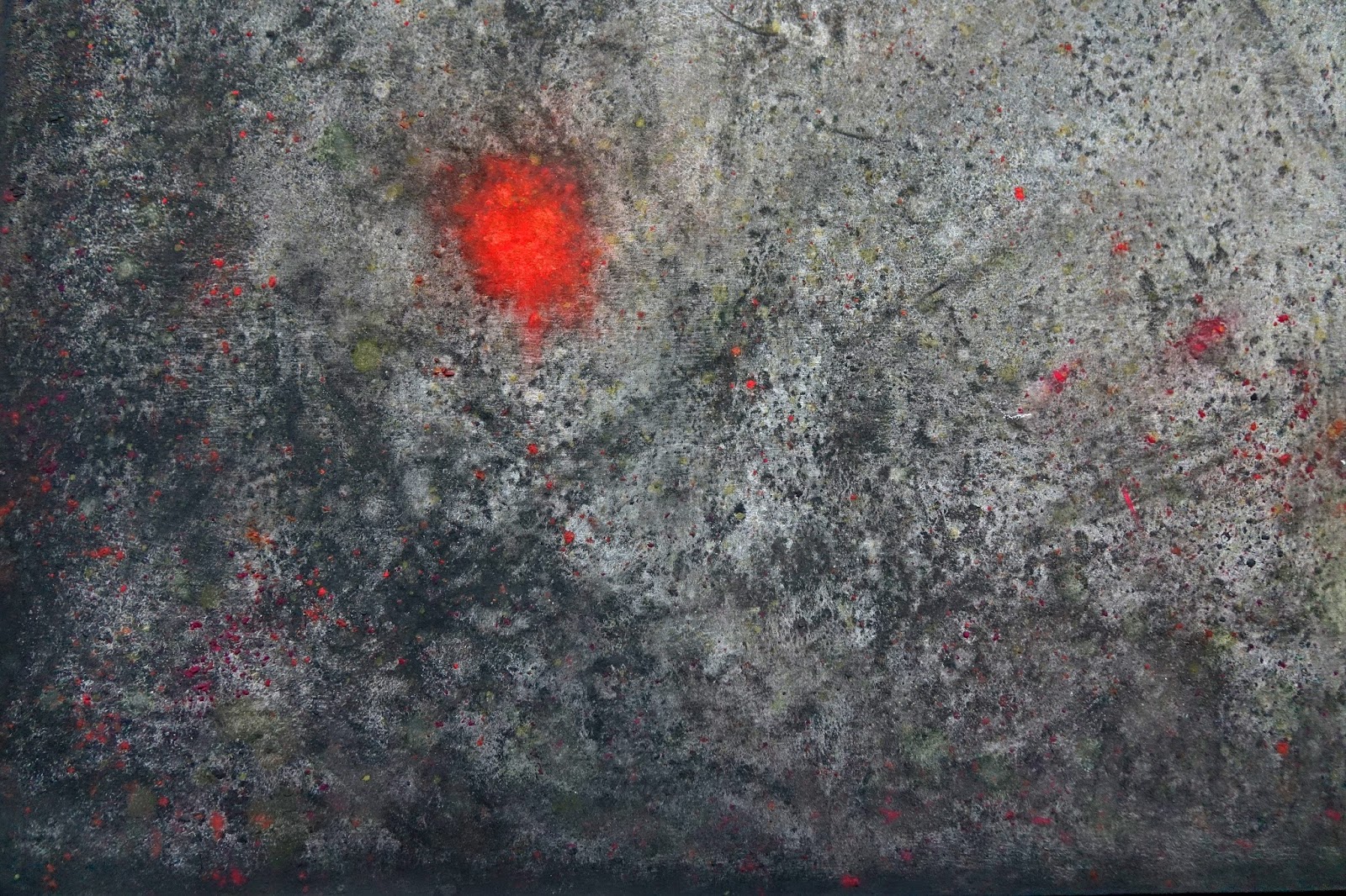
   In  order to figure out the best pencil to use for the Red Letters, I tested a few on the tape at the edge of the board, an covered them with wax. It clearly showed that using the Red Pastel pencil turned very dark, and that the best way to achieve a bright red was to use a layer of White Charcoal, a layer of Red Pastel, and finally a layer of Prismacolor Carmine Red :


Friday, October 13, 2017

Post 29: Moving along with "Magic Chalkboard"

    I printed all the images on scale and cut them out. After sanding the chalkboard finish smooth with 220 sandpaper, I rubbed a white pastel stick on, drew some lines and erased most of it with a chalkboard eraser and a paper towel.
  The next step was to draw the circular chart, divide it in 7 segments, then each of those in seven more to get the 49 slices. I transfered the Eye and circles drawing, added the letters, Wrote the "We the People" from the Declaration of Independance above the drawer. I laid on the panel all the images to get an idea of the look, and am pleased with the "Trompe l'Oeil" effect, even whithout the shadows drawn in :


       When I picked the circular chart, I actually had no idea what it was about, it just looked interesting to me and fit the composition.


    I set out to research what it meant, and discovered all the stange names starting with a B were connected to "Enochian Angels", and a "language" seamingly made up by John Dee, a 16th Century English "pseudo scholar" with the help of a Medium. The idea was picked up in 2002 by a weird web site peddling all kinds of paraphernalia, incenses and talismans very loosely connected to the original concept. In other words, this chart was plain bullshit!
     The painting so far had no subject, and was still, as often happens with my ideas, just a graphic and interesting composition. I had been concerned lately with the challenges to the First Amendment coming from our #notmyPOTUS, and decided to write it around the circles of the chart. It happened to more or less fit the chart, so I fiddled with the chart and the number of letters and spaces to make it fit within the 49 segments:


   I then set out to make it look good, tried various fonts and symbols, and ended up with this:


Tuesday, October 3, 2017

Post 28: Test Panel looks Good!

 Well, I sanded the primed panels smooth with 180 grit sandpaper, and put on 2 coats of Chalkboard Paint, letting them dry overnight, and sanding them smooth. In this particular case, I want to avoid the fine grainy foam roller texture I usually like, and have a smoother surface similar to a real chalkboard.


    I first rubbed orange, green, black, and white Rembrandt soft pastels, as well as harder white chalks on the Test Panel and erased with a pad, wrote things and drew lines and circles and erased again, to create the illusion of a well used chalkboard. I then used a General's White Charcoal pencil and Conté white pencil to draw circles, lines, letters, triangles, etc... These do not erase much, but I erased some areas. I wiped the panel lightly with paper towels to remove loose powder, and glued some images I had laying around using thick Acid Free Yes Paste. I used a brayer with fairly light pressure to press them down without squeezing out the glue, and after a while pressed the edges down with a small wooden convex wallpaper seam roller.
   The next day, I rolled the edges some more with a lot of pressure, and rubbed them with a burnisher to press them down. I worked on the background some more with pastels, chalk and pencils to add more visual texture. I then brushed 2 coats of clear wax medium over the whole panel, and fused it.
   The next day, I polished it, and it looked good, but the wax was much thicker in some areas than others, and I decided to scrape the excess off as I usually do. I am well pleased with the result, and ready to use the same procedure for the larger Chalkboard:


Friday, September 29, 2017

Post 27: Designing and Starting the Next Piece

    Since the begining of this projects, the Mockups were created in Photoshop way ahead of the actual Paintings, and that gave me time to let them mature, modify them, add or substract elements, incorporate new ideas, and refine them in various ways. I still have one of my original designs in reserve, working title Khabahla:


     But I suddenly became intrieged with the idea of using an old fashion Chalk Board  as a background, with still visible erased figures and equations melting in the background,  a clear circular Astrological Chart drawn in white chalk, and a trompe l'oeil arrangement of Pulleys with a Red String, and a buzzer with button and wires. I also liked the idea of a small drawer built within the thickness of the panel, containing some yet undefine "Talisman".
    I chose the working title "Magic Chalk Board", and started to build it with a wood frame, adding the circular Esoteric Chart and an optical sketch, the buzzer, the pulleys. I can't explain how the green frogs came about, but they have been favorites of mine, and made appearances numerous times in my light shows. They bring whimsical touch, a srong color, and a very realistic trompe l'oeil effect.
    This is where I am at this stage, and I am pretty happy with the design. It will no doubt evolve, but I feel strongly enough about it to get started with a 32" x 48" x 4" thick panel I already have.


    I cut out the drawer front with a thin saw, built a box in the back to receive it, and built a shallow drawer out of Aromatic Cedar:


    The next question at hand is: what is the best way to achieve the look of a real chalkboard? There are 2 choices: use a technique similar to the one I used on the lower dark gray part of "Sepultado"(pigments and gum arabic in water, dry pigments, pastels), or actually make the panel into a chalkboard using chalkboard paint and use chalks and eraser to age and texture it, leaving remnants of drawings and writings.
     I tested the chalkboard paint idea on a small panel, covered it in wax(which made it darker, lowered the contrast, and obscured a lot of the subtle textures and colors I had worked in), scraped it smooth, and polished it. It looks pretty good:


     And the good thing about the chalkboard paint is that it is a very tough stable surface to glue the images to BEFORE laying the wax down. I will need to be bolder with contrast and color to compensate for the dulling and darkening caused by the wax.
     I am ready to paint the final panel with the chalkboard paint, as well as a second test panel to figure out the best glue to use to attach the images.

Post 26: Time flies and I forget to Post what little I did in the past few Months...

   I did work on the Vetruvius Baby Concept I created in Photoshop months ago. First, I reworked the design in Photoshop, replacing the wax seals at the top corners with Coca Cola Buttons, and adding a bat skeleton over the  wings and bottle:


    First,  I taped out the bottom part of the 32" x48" panel, and created the dark mottled marron texture with pigments, pastels, sprays of gum arabic in water. Next, I taped over that part and did the blue bottom area, mixing shades of Cobalt blue pigments with large  brushes, rubbing colored pastels lightly for visual texture, and sprinkling contrasting color pigments. After brushing wax over the whole panel and fusing it, I scraped it back and polished it. 
     I printed all my archival images, and starting incorporating them in the wax layer. I am now at this stage:


     The Esoteric circles and figures will be scratched into the wax surface last,  the grooves filled with  a mixture of orange and ochre shades of wax, and scraped back.
    I am realizing that even though I don't really like the veil of milkiness that the wax creates over the darker colors where it is thicker, I may have no choice but to accept it, and even embrace it as being the nature of the medium...
    One way to minimize it would be to adhere the cutout images to the board BEFORE laying down any wax at all, instead of adding them after the background has been coated. Since I am now fixing the pigments and pastels with gum arabic, it should be possible. I will try that with the next piece.
    I will need an adhesive that holds up to the heat so the larger images do not buckle and bubble. Possible options are: gum arabic, casein, book binding paste, acrylic medium, YES glue, acid free wood  glue. The back of the printing paper may make a difference, and light sanding might help. All these options will need to be tested before I use the technique on a real piece. 

Sunday, May 14, 2017

Post 25: Not much Happening Painting wise for the Last Few Months

    I do wish I had spent more time painting in the last few months, but Politics seem to have taken over my life. I don't even know if my Activism is doing any good, I just had to do it.
   I have managed to work on this Project a little though, and Trompe l'oeil window is almost finished. On the other hand, "Mugshots" is on hold until I can figure out how to work in the large black nude figures.
    Going directly from 1sq.ft to 24 sq.ft encaustic panels may have been a little too ambitious... Also, thinking of selling, even though it would make a great looking show, it's a pretty large size to fit in a  house. So I decided to scale down for a while, and built three 3ft x 4ft panels, sanded them, and primed them with 2 coats of  Golden Absorbent  ground using a small foam roller, to give them just enough tooth to catch the pastels.
   I decided to start with the previously Photoshop designed "Sepultado", and reworked the concept a little, fitting the 3x4 ratio, adding two old spikes, a green poppy pod, and a bee on the Bronze Hands:


   I suppose I should take the time to explain the concept of the piece. Back in 2000, I was planning to continue the Series of "Dummies with Souls" after building my house, and made full blueprints for a lifesize "Sepultado" inspired by those I had seen in Guatemala on Holly Week. 


    It is basically a jointed wooden  figure of Christ that is actually hung on the cross on Good Friday morning:


    It is taken down at 3 o'clock in the afternoon, and laid down on a slab covered by a shroud. It is later placed in an ornate Glass Coffin supported by a huge Float, and carried in Procession all evening:


   Unfortunately, it took more than 3 years to build the House, and I never got to make my "Sepultado". I did manage to cast the hands and the feet in Bronze. 
   It seems fitting to use the blueprint in this new project, as well as an image of the hands, wich is all I have left since they were sold as a set:


    The symbolism is obvious. There are many other elements and Symbols of the Passion that could possibly be used as well: a Blooming Red Poppy from my Dad's Garden, a sponge, nails or spikes, a hammer, dice, a crown of thorns, the ladder, etc...
   But first, I needed to do the background painting. I starting rubbing in shades of ochre on the top part, and transfered an enlarged image of the blueprint:


   I also decided to include the face from the Shroud of Turin, enhanced the contrast in the original, reversed the tones, rubbed pastels on, and transfered a loose image by rubbing the back of the paper with a spoon:


 I decided to try a new technique this time, and used pigment mixed in water with some gum arabic as well as the dry pigments. I tilted the panel to make the "watercolor" run, sprayed, used toothbrushes to spatter with colors,  sponged, dripped, sprinkled dry pigments on the wet surface, sprayed with a solution of gum arabic , and kept working it until it dried to something I was pleased with. I then lightly rubbed pastel sticks to mix in colors in the generally grey bottom area.


I ended up with this background painting:


    I am not sure yet whether the line with be black as originally intended, or remain light as it is now. I like to remain flexible. Actually, flexibility is built into this new "Photoencaustic" technique I am making up as I go. I went ahead and printed the images on scale, including some alternate choices, and cut them out precisely:


   I am then at liberty to place them on the panel, try different ones, move them around, and adjust the composition. This is the version I have now, but it is subject to change. The main decision is between the green Poppy Pod and the Blooming Red Poppy:


Friday, February 10, 2017

Post 43: Where am I?

  Well, the pigments, pastels and wax background for "Mugshots" is almost finished:


   The small test I made with the nudes printed on Japanese paper showed the potential problems:


     1. The medium tends to create a certain amount of cloudiness in the dark tones and mute the contrast, so details get lost. I should increase the contrast in the final prints.
     2. When trying to scrape the layer of medium as thin as possible over the image, it is very easy to damage it, especially around the edges, which tend to curl up when fusing. I will have to press the paper down into the wax by warming the background and using a brayer, brush medium over, and burnish the edges down so they are buried deeper in the wax than the center of the image. 

    Now, as far as "Trompe l'Oeil Window" is concerned, I did the baseboard and the window frame(including the inside edge, incorporated the Green Envelope(I had to darken and detail the trompe l'oeil shadow with pastels), the Bug, and the Key on top. There is still some milkiness on the Window Frame, so more wax will need to be scraped off, but carefully, as it is easy to scrape back to the white gesso. I messed up the Nude Black and White Photograph(milkiness and white scrapes, and am considering cutting out a second window and mounting the Photograph behind thin acetate.
   It somehow seems to me now that there are not enough Photograpic Elements to the painting, and that I could add a little complexity. Of course, the Hanging Light Bulb is missing, but still, the Window looks dull. I had a sudden idea, and tried to place some actual objects on the botton ledge of the window, the usual culprits of course, my trademark symbols: a Domino leaning against a Small Red Ball, and a Dice. It works, and brings life to the painting!


   So I believe the pieces are going to end up even more Mixed Media than I thought... The only downside is that the real objects tend to lessen the trompe l'oeil effect of the incorporated photographs, and I may have to somehow subdue them with matte spray.