Sunday, January 29, 2017

Post 41; Testing the new scanner

    I got the scanner a couple of days ago, and started testing it with my original nude slides for Mugshots. It comes with both its own Cyberview driver, and with Silverfast8.
   The Cyberview Driver prescan looked pretty good after adjustments, but when I tried a scan at 5000dpi with Dust and Scratch Removal, Grain Reduction, and the Double Scanning HDR like feature, it took an hour, and the result was completely whacky, although actually quite good looking:


   I then tried the Silverfast Driver. First results with manual histogram and curves adjustment, iSRD Dust and Scratch removal (similar to ICE, with an infrared scan) were good, but a bit muddy(right), so I tried cutting out some black, but then lost detail in the deep shadows, although the overall scan looked much better(left).


    It's actually always been the problem with slides with a full range of densities, even wgen I had rgw Nikon scanner.
    I thought I would use the double scan with the HDR like feature, but realized that to do that, I would have to spend $70 to upgrade to Silverfast Plus... Bummer! So I wondered whether I can just do several scans and combine them with Photomatix Pro as I do with photographs. I combined the two scans, and the result showed better shadow detail, better highlight detail, and much less grain:


    In fact, I am quite impressed, and think I won't spend the extra 70 bucks to activate the HDR feature. In fact, I think I might do even better, using 3, may be even 5 scans from light (good detail in the deep shadows) to dark (good detail in the highlights). I tried

Monday, January 23, 2017

Post 40: Printing the Big Black Mugshots

    I want to print the big images on Chinese Mulberry Paper for the final painting, but they are only 1352 x1155 pixels. These nudes were shot and the slides scanned a very long time ago, and even printing at a low 150 dpi, I could only blow them up to about 9"x10":


    I am going to have to find the originals and re scan them at a much higher definition. Which means that, since my Nikon Scanner doesn't work anymore, I have to find a new one. My Epson 3170 Photo, has the capacity to scan slides, but the definition would not be sufficient, and I never found it practical to use for that purpose. 
   I tore down my storage area to locate my original slides of nudes shot many years ago, and have a treasure trove of interesting images to use. So I did some research, and settled for what is generally considered the best mid range dedicated slide scanner, the Pacific Image PrimeFilm XE 35mm Film and Slide Scanner, which "on paper" has a 7200 dpi resolution, a color depth of 48 bits, a dynamic range of 3.9, dust and scratch removal, digital noise reduction, and multiple exposure capability. 

Post 39: Still not sure, just one more study...

    I am concerned that the blues are going to turn too dark to give me sufficient contrast with the solarized images of the model, so I am going to make a small test panel. 
    I received the Smooth Heavy Durt Mulberry Chinese paper I had ordered from amazon. It is about 70 lbs, and the sheets are actually 18" x 27", instead of 22" x 30". It has no deckles either, and comes folded over twice, may be that explains the ridiculously low price for at least 100 sheets... I tried to flatten it under weights and clamps, but got nowhere. Actually, it doesn't really matter, since I am going to wrap it around the 17" x 22" sheet of thin cardboard that came with the Epson paper for  printing, so it doesn't buckle and tear. It is thick enough, lays flat, and is transparent enough that wax should make it clear.
     But first I want to do a test print on each side of the sheet to see which is best, so I cut two 9.5" x 13"  , and taped them to 8.5" x 11' sheets of Epson Matte around the back, marking which side was which. I cut the image down to size in Photoshop, and printed it on both. It turns out the side of the paper that is turned in(I assume the front) gives better detail in the blacks.


    I will do a small Study/Test on a 12" x12" panel primed with the same absorbent ground. First, I paint the edges black, and put a coat of black wax on top.
   A piece of 1/2" tape will leave line between ochres and blues. I worked in the colors with pigments and pastels more or less like the big panel, put a couple of coats of clear medium on, fused them, and scraped back. I then applied the cutout images on tissue, rolled them in with a brayer, covered them with clear medium, and fused. Looks like it's going to be fine:


    Here it is after scraping and polishing:


Wednesday, January 18, 2017

Post 38: Now the Hard Part: the Abstract Blue Field

     I kept that part for last because to me it is the most difficult, and it is critical to get it right. It is mostly a variation on tones and shades of aquamarine pigments, many shades of blue(I have 3 different Ultramarine Blues), with purple in the darker areas. Actually, I mixed four very dark shades of blue, green, violet, and purple using transparent Ivory Black pigment. I almost never use "plain" black, simply because there is not such a thing in nature. Tint, reflections, stains, light itself create a multitude of blacks within what we call "Black". Never assume Black is just Black, and never use opaque blacks. Ivory Black is the only one I ever use, be it oils, watercolor, or pastels.

Tuesday, January 17, 2017

Post 37: Getting Medium on "Mugshots" Lower Field

    I am always amazed at the time it takes to do the medium coat, not to brush it on, but to make it fairly smooth and thin so the colors glow. I had a hard time today with this one: may be trying to make it too thin, I kept scraping down to the white gesso, cussing myself every time, and had to make a lot of "patches".
    Before I finish the Upper Blue Field, I want to think about it, and print most of the images, so I raised the painting and clamped it to the table":


     As with the previous painting, the mockup was only a small image, so I have to first finalize the images that I will use, and find them large enough to print at 300 DPI's. In the process, I end up making some changes to the original idea. I looked for images of old slates, both from police departments and schools, and found one I liked a lot:
      I also decided to look for something better than the old Dollar Bill to tape to the "wall", something more meaninfulwithin the painting. I looked at a lot of old mugshots. There is a great collection on the Internet of Australian mugshots from the teens and 20's, such as this great one:


    I also found a high quality "Test Mugshot" of the inventor of the mugshot, famous French forensic precursor and theorist Alphonse Bertillon. He was the inspiration for a lot of Sherlock Holmes investigative "coup de force":


    I started thinking of taping several mugshots to the wall, and he belongs there , but I needed more meaninful shots. The piece is about the decriminalisation of drugs, which I favor, and the overcrowding of prisons with minor offencers (courtesy of the 3 times you are out Reagan laws) that should never have been locked up in the first place...
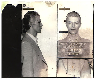
    I found a great one of a yound David Bowie busted for possession of Marijuana in 1976:


   Then, with the recent John Lewis vs Donald Trump dispute in the news, a mugshot of him from a 1962 arrest in Nashville re appeared:


Post 36: Back and Forth

   I spent a couple of days working on the abstract background for Mug Shots, doing first the blue stripe, and then taping it, as well as the other stripe, to work first on the large blue area, then on the lower ochre area. I did some scribbling and drew both dark and light lines first on the white gesso, then laid on top various shades of blues and purples, applying raw pigments with wide bristle brushes(one for the lighter colors, one for the darks).The colors go on very smooth , just like paint. Of course, the panel has to be flat, and one has to be careful not to raise dust. 
   Just a short paragraph on Safety. I was concerned about the toxic effects of certain pigments, and read a few books on the subject. It is impossible to folloew all the rules of safety laid out in the books. They might just as well be OSHA manuals for the workplace! Their authors are so afraid to be sued that   instead of giving simple practical usable advice, they put so many rules and regulations on you that I just threw my hands up. Just the fact that I wear a beard and refuses to cut it no matter what is already a big problem, since I fail all the respirator tests. I hate the damn things anyway. My studio is in my house, has no separate ventilation system, and there is not much I can do about it except open the door, that's another "big" problem. My only option was to systematically eliminate every pigment that was poisonous or toxic. I like natural pigments as a matter of principle, and they tend to be the most permanent, so it wasn't really a big problem. I just had to get rid of Cadmium Yellow, Cadmium Orange, and Chrome Green. I ended up with a palette of Ultramarines, Natural Earths and Oxydes, Mayan colors, and "Non Toxic" brighter shades of Yellow, Orange, Red, Green, Purple and Blues from a place called Earth Pigments:


   I am very careful handling the raw pigments, sometimes I wear a face mask, most of the time I don't. I have two round palettes where I keep small amounts of pigments, and keep them covered when I don't use them, I don't get my nose close to the pigments, I try not to sneeze or cough(so far so good). I can't stand working with gloves, so I wash my hands frequently. I use brushes to apply pigments rather than my fingers, it works better anyway. I brush the extra mixed pigments left on the panel and on the table gently into plastic containers marked Yellowish, Reddish, Bluish, Purplish, Brownish and Greenish, so they can possibly be re used.  I use wet paper towels to wipe the dust off the table and  the floor(no broom, no vacuum). I think it is about as much as I can do for safety, and it's more than I did when I first worked with pastels. My safety check is to clean the inside of my nose with a moist tissue at the end of the day, and make sure it has no noticeable coloring. I believe, I will be fine. 
    Now, of course, to cover my ass, I am going to tell you: DO NOT DO AS I DO, it might poison you, fry your brain, pickle your liver, cause nerve damage and lung cancer, may be even kill you. But then so do all the legal poisons on the market (alcool, cigarettes, pain killers, a lot of prescribed medications, etc...), that kill far more people than Cadmium Yellow, which I don't use anyway.
    OK, that was my rant for the day.
     When I got the whole panel covered with color, I felt I should stop for a while, until I knew what to do next. Once I cover the panel with medium, my options get more limited, and I want to refine the texture with pastels as I did on the background of "Trompe l'Oeil".


     So I went back to "Trompe l'Oeil", and worked on the back panel at the other end of my giant table. I love having the space!


     I finished the back window frame and the dark background for the nude, and started spitting on the panel and blotting with a paper towel for texture. I rubbed flat pastel sticks of contrasting colors lightly on. I realized that this particular panel was too smooth. I need to remember to leave more texture when I roll the gesso on, and may be use a little more.
   After a while, I also used a very dilute solution of Gum Arabic in a spray bottle to create various spots, smears, and eventually fix the pigment on the board. Finally, I tried the images on for size. As I already knew, the light bulb is way too small, and I will print and cut out the new one. But I find the trompe l'oeil effect of the target just laying there already quite effective, and am well pleased:


    Time to switch back to "Mug Shots". I now knew what to do next to the lower ochre area, basically the same, but with heavier texturing using the pastels both flat and straight to create random  lines and textutes. I uncovered the blue stripe so the scribbles would appear continuous, and I gave it a subtle texture with pastels in different shades of blue:


Wednesday, January 11, 2017

Post 35: Starting a new piece!

    I figured out early on that it would be convenient and practical to be able to work on two pieces at the same time. That's why I built this huge 4ft x 14ft+ tabletop, to accommodate two 4ft x6ft paintings, and leave a couple of feet in between for encaustics, pastels and tools.
    I found a convenient out of the way place for my big Epson R800 printer on a chest just a few feet from the computer. I also put two 22" monitors back up on brackets on each side of my 50" Sony, and a third mobile one is used to have a picture of the mockup right in front of me on the panel when I paint.


     I also primed a basic 4ft x6ft braced plywood panel to get started on the next piece, which will be based on my early mockup for "Mug Shots":


    Two  preliminary studies helped me figure out how to do it, or so I hope: