Tuesday, November 15, 2016

Post 14: Old Kufic Arabic script

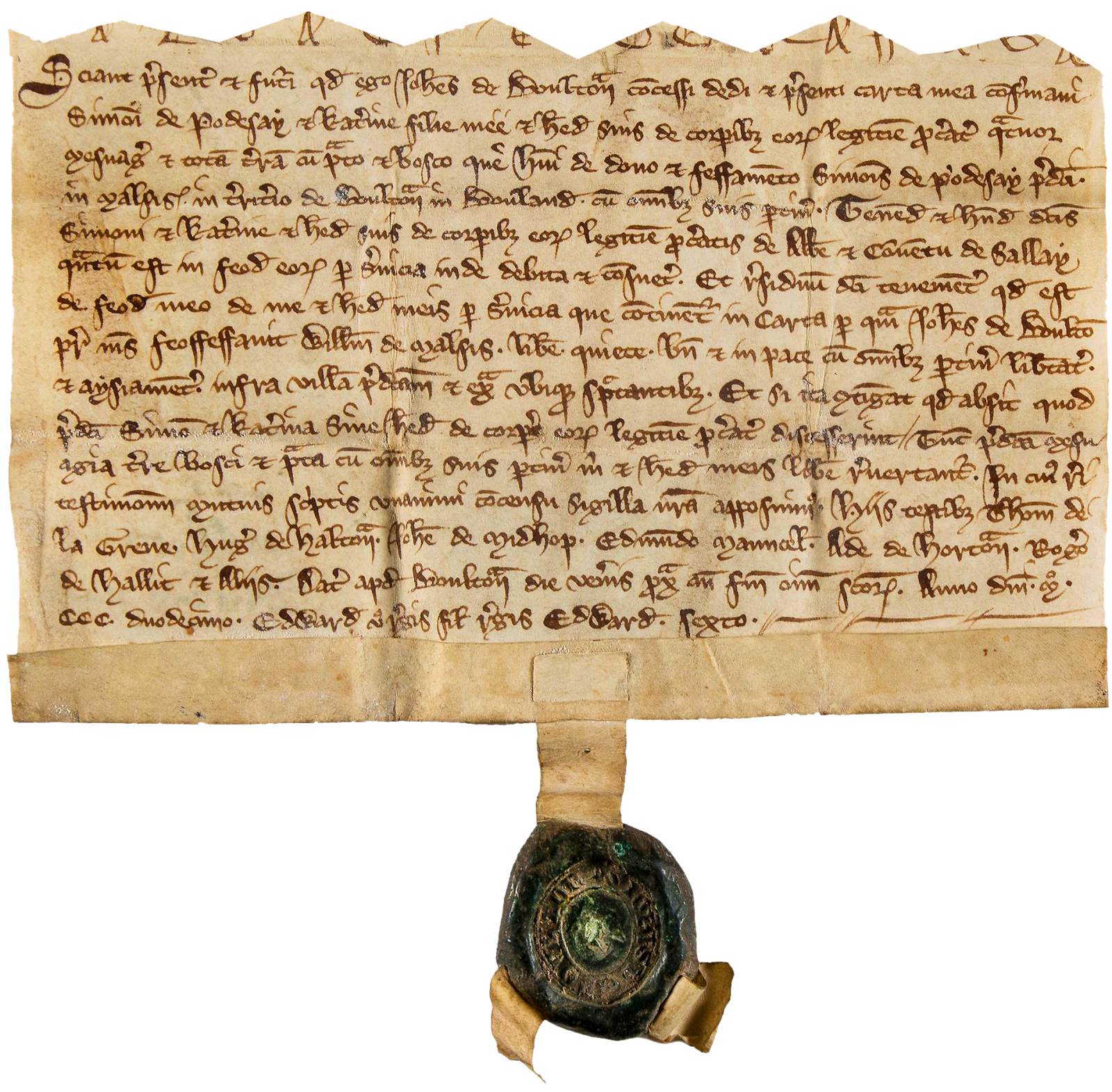
   For many years now, I have been interested in calligraphy, fonts, and the amazing varieties of Alphabets and Ideograms man created in different parts of the world over millennia. I have collected many old documents and manuscripts from all parts of the world: Phoenician, Aramaic, Arabic, Persian, Hebrew scripts in the Middle East; Coptic, Egyptian, Adrinka, Tifinagh, Tsibidi and more scripts in Africa, the numerous Bramic scripts of India, Burmese, Chinese, Japanese, Korean, and on and on...
  The various Arabic scripts have become an Art Form: 
  
    Of course, I also like Runes and Ancient Symbols, including the Swastikas and backwards Sauwastikas that I saw drawn with cow dung all over Hindu Temples in India.


    I find most of the old Scripts much more beautiful than our Modern Western script, and since I don't know what they mean, letters and words are like Pure Artwork. 
    In this new project, I would like to include some of    these as a reminder of our diversity, our ingenuity, and as a "hidden message". There are words that particularly matter to me, having to do with life, values, good vibes, but I don't like to use our western words in a painting. I find that too obvious. I don't want people to be able to read them, so I want to scatter these words in scripts and symbols very few of us recognize all throughout the paintings, as a kind of "subliminal message" that is also graphic, beautiful, and an integral part of the fabric of the overall painting. 
     For some reason, I started surfing the web yesterday looking at the old Kufic Arabic script, the simplicity of which really appeals to me, and was especially struck at the ressemblance betweeen 21st Century QR codes and 7th Century Square Kufic words:


       I thought it would be interesting to include both in all paintings, the former explaining the latter. I could also of course include more info about the painting, a bio, links to my site and blogs, etc...

Post 13: More Test Panels

    When I realized paper was not a good background glued to masonite panels because it buckled and curled when wetted or heated, the only other option was to use Gesso. R&F makes a special Gesso for encaustic that is porous  enough to accept the wax, but it is very expensive. Evans Encaustic in Atlanta makes one that is cheaper, and has the advantage of coming in several beautiful colors. I also ordered the Absorbent Ground made by Golden. 
   I primed some panels with both yesterday using a wide soft Goat hair brush. The Evans Holly Grail Gesso seems to cover better with two coats than the Golden, and dries smoother, with less brush marks. It also seems more matte, the Golden has a slight sheen. It is too soft when freshly dry to be sanded between coats, but seems to harden overnight. I will definitely try the colored Holly Grail when I start doing larger pieces.
    I still have two panels covered in paper started last week before I had the gesso. For the first one, I wet the watercolor paper and did a yellow ochre background with touches of brown, red and green, and used tooth brushes to speckle it. Then I drew a grid with a Prismacolor sienna pencil, and covered it with two coats of medium which I fused:


      The other panel is a test for the projected three dimensional "Trompe l'Oil Window" I did a mockup of a couple of weeks ago:


     Before I incorporate the photographs printed on tissue paper, I have to create the illusion of an old stained, scratched and grimy plaster wall with a baseboard and a window frame. I am not sure at this point whether they will be wood molding or Trompe l'Oeil". 
     I taped out the baseboard and used ochre and black pigments to color the paper. I removed the tape and dirtied the baseboard,  then brushed clear medium on from all directions to create a lot of uneven texture, and fused it. That looks like a pretty good start once buffed:


Saturday, November 12, 2016

Post 12: Testing a Black panel with Grooves

   I thought I might well mess up this one up the first time, so I just used a piece or masonite covered with white paper, which I stained yellow by rubbing pigment on. I should have started with yellow paper. I put on a clear coat of medium, and then stippled about three irregular coats of medium tinted in different shades of ochre, which I fused and scraped. I was surprised at just how much wax I used.
     I melted more medium to mix a big batch of black, and made the mistake of putting the hot crockpot liner down on top of the panel, which melted the wax and created a donut shaped hole... So I just filled it up with red and yellow ochre medium, scraped off the excess, and stained the middle red with oils. I also rubbed on some white, red and marron oil paint from tubes and wiped most of it off. After fusing, it actually looked pretty go, so I stopped to think and took some pictures :


    The layering, rubbing, scraping, fusing, and buffing actually creates really interesting fine textures and brilliant colors:


    I considered keeping the panel and starting over, but finally decided to go on with it, and put down irregular swatches of a dark maroon in the middle and ochre around the edges,  which I fused. Over that went a thin even layer of yellow ochre, and finally a  layer of black medium, leaving some pits showing the yellow. 

     I was very careful scraping back the black, and very slowly removed very thin slices of wax, constantly turning the board around to change the scraping angle, and trying my best not to cut any grooves. I found that covering the blade with a thin layer of mineral oil  will keep the scraper clean and
avoid the shavings getting stuck on the surface.


    Once the panel was smooth, I kept on shaving the black wax thinner and thinner until it became translucent, and some of the ochre and maroon grounds below showed in places, especially around the edges. I tried to leave the surface as smooth as possible and polished the panel with paper towels:


     I think fusing and scraping again is an option, and might yield interesting results, but what I have is pretty nice, and I am ready to cut grooves into the surface, both straight and curved. There will be no correction possible, so I think I am going to do a mockup in Photoshop to get an idea of what it might look like before I start...


     It will be hard to do without French Curves templates. I suppose I could cut my own, but I already have some on order. I will try to manage with the compass. For the straight grooves, I tried the narrow Lino Cutting Gouge, but it raised a substantial burr, and I switched to a very small scraping loop which I squeezed with pliers to make it even narrower.

      I worked on the grid first with a ruler and that tool. It turned out my layer of black wax was way too thick, and the grooves had to be very deep to reach the yellow layer. I had to cut through the wax many times, and the grooves ended up too wide, with quite a burr. I cut the helical groove by hand with the Lino Cutter, and as expected, it didn't turn out very smooth. I will definitely use French Curves Guides next time.
      I ended up with this, which was way too messy looking, with the grooves too deep, too wide, and a rough  helical curve:


     I had no choice but try and fill the grooves with medium in shades of  ochre.

     Before I started, I use a wheel to score dotted lines.
     The whole panel ended up covered in yellow medium, and it took a lot of careful scraping to get it down to a thin covering of transparent yellow medium over the black wax. I am almost there, I can see the black burr lines :


     I rubbed some mineral oil on the panel so the high, lows and hazy areas would show better, and carefully shaved the rest of the yellow wax layer off, revealing the pure black background.


      The final result is a long way from what I had in mind, and   I don't really like it very much: too much yellow, not enough black, too bold, too garish, lines way too wide, uneven helical curve, etc... But I learned a lot doing it:
     1. There is no need to waste expensive medium building thick layers. A thin layer of ochres topped with a thin black layer would have worked better, and allowed much narrower grooves. In order to lay down a thinner layer, the panel has to be heated, and the wax on the brush kept hot and liquid using the heat gun with the left hand. Wider brushes make things easier, and with the 6" Hake Brush, it only takes two strokes to cover a 12" panel:


    2. The colors are too bright, I need to mix more subdued tones.
     3. The helical lines cut by hand are not smooth. I need to use French Curvest to draw the curved lines. I now have a  small 12" set, but I need a set of 24", and for large paintings, I will need to make my own out of masonite.
     4. The yellow areas are bigger in relation to the the black background than they were before I added the lines because of the extra scraping. I need to keep that in mind next time.
     5. The intersection of 3 lines may be messy, so I need to plan better and avoid them.
     6. I like the dotted lines done with the 4mm wheel a lot, so to vary the lines, so I ordered a set of three smaller Excel Blades pounce wheels:


Thursday, November 10, 2016

Post 11: Lessons Learned so Far

     I will be doing many more practice pieces with different techniques, but I have already drawn some lessons:
    1. Gluing paper to the board is not a good idea, as it tends to come loose and bubble under heat, and curl up around the edges when using watercolor. I do love the idea of working on paper, but I suppose I will have to give it up and use the specially formulated absorbant Gesso instead.
     2. Plain pigments work very well to color the medium, and are much cheaper than oil sticks. It actually takes very little pigment, and the colored medium retains much transparency.
     3. Rubbing oil sticks on and wiping it off to fill in scratches, pits and grooves with contrasting color works very well, but these oil sticks are expensive as hell!
     4. Cutting grooves in the wax surface, overfilling them with colored wax and scaring it back produces wonderfully clean lines. And I definitely like patterns of curves and straight lines. While doing research yesterday, I ran across this image, which I absolutely loved:


   It looks like the grooves are cut in the black to reveal the yellow layers below. Whether it is done that way or not, I want to experiment with that technique.
    In fact, I liked the piece so much that I went back, and found out it was the work of Elise Wagner, an Artist that has been working with encaustics and oils for many many years, and has produced an extraordinary body of work. Do look at her comprehensive web site, especially to her Archive going back beyond 2004. I am by mo means in love with everything she produced, but there are a number of her pieces I like very much:


Tuesday, November 1, 2016

Part 10: Small Practice Pieces

     I have about a dozen of roughly 12"x12" braced masonite panels, and will use them for "practice", trying to use a whole range of techniques. I bought a pad of acid free Canson Watercolor Paper, that will be glued to the panels using acid free YES glue, and trimmed with a blade.
     Some panels will be worked on with pencil, ink, crayons, watercolor, and collage before the first coat of wax is applied. Some backgrounds can be tinted with a solid base color, some with patterns, or distressed. 
   Some panels may be partly painted with wax, and then with ink or watercolor, in a process similar to Batik. 
   Others may be painted directly with wax. Wood glue or shellac may be burnt with a torch to create patterns. Color tissue, cut or torn, may be used for collage and encased in wax. The wax surface can be carved, scratched, grooved, scored, and the lines filled with oil sticks or wax. It can be rubbed with  pigments, pastels, oil paints.
   For the first panel, I started with a few black and red pencil lines on the paper,  used a circle stencil to lay down a thin red wax circle that I scraped back, applied several layers of yellow beeswax over the entire panel, scratched and scored it, scraped the surface back, scored a circle with a large set of points, filled the catches with black and red oil sticks, and wiped the excess off with paper towels, used my finger to rub oil paint into the surface, fused the surface, and highly buffed the whole thing.

     For the second panel, I first wrote "Carpe Diem" multiple times in colored pencil on the white paper, then laid a yellow watercolor background, covered it with several fused coats of medium, scratched lines in the surface with a stylus, rolled a dotted line with a toothed wheel, filled the grooves with oil paint, made pools of red shellac and set them on fire, fused, laid another layer of medium, fused, and finally rubbed the whole surface with a red oil stick and wiped it off, leaving red scratches and pits:


     For the third panel, I used watercolor paper, laid the black line with india ink using tape, painted the yellow and red ochre with watercolors, and laid several coats of fused medium while sprinkling dry pigments. The black inverted nude image was printed on Japanese paper, cut out,  laid in soft sticky wax, burnished, and covered with a couple of coats of fused medium. Finally, I covered most of the surface with red shellac, burnt it, and used the torch to fuse it in:


      For the fourth panel, I first coated the watercolor paper wit medium and fused it, laid japanese black and yellow paper into the soft wax, rubbed them in with my fingers, covered the tissue with several coats of fused medium, adding three little black squares on top of the yellow paper, and scraping the wax. The black paper had small newspaper inclusions, and since one of them was red, I rubbed the Yellow area with a red oil stick and wiped most of it off leaving red paint in the scratches and pits:


       For the fifth panel, I first drew circles in pencil, then scorched the paper with the torch, burnt black spots, painted red shellac over and set it on fire. Only then did I put several coats of medium and fused them. I used a very small scraping tool attached to a large set of points to groove the circles lines back down to the paper surface. The grooves were filled wit black and red wax and scraped back level, creating clear sharp lines. I finally painted red shellac on some areas between the lines and burnt it, and fused the whole surface lightly with the torch:


Tuesday, October 25, 2016

Post 9: Designing my Signature Seal

   I knew I wanted a large round seal, so I used this one as a template of sorts:


     I started to rearrange the letters to read "CARPE DIEM" around the top, and my name  around the bottom. I looked through my file of esoteric images, and found an interesting Star and All Seing Eye. I then worked on some stylized version of my longtime "symbols": the Top, the Dice, the Level/Plumbline, and the Gear.
   I want the seal to look old and worn, with almost a Medieval feel. I tried a bunch of fonts out, and found one I liked a lot that looks both old and ragged. It's called "Trattatello":


   I had to reshape some of the letters slightly, widen the C and the E, redesign the Q, and curve the words to fit around the border. I included my birthdate in Roman Nunerals. 
  This is what I ended up with:


    I made a mockup of what it would look like in red wax:

   I ordered the largest 45 mm seal from Nostalgic Impressions , and it cost me $110. I also ordered pellets of red wax. I should have it in about a week.
   A small 3/4" seal would have been only $45, and I may yet design one using just the center part with the initials to use on small pieces. 

Sunday, October 23, 2016

Post 8: Using a Wax Seal for Signature

   My intent was from the start to design a wax seal to sign the encaustic paintings. I have always loved old letters and old manuscript documents with Wax Seals. 
   In fact, I had one made a long time ago, but have not used it much because it is too plain. I also have a collection of Chinese seals, and had one made over there that is supposed to be my name...   There are several ways to apply the seal, first on the document itself:


     More important documents have a reenforced bottom flap around which run strips of velum on which the seal is applied with wax on both sides:


     This is an interesting "indentured" deed, which was cut in half in a zigzag pattern so the two halves could be matched. That's where the word indentured came from:


Some documents have strips cut directly out of them on which the seals are applied, but it seems rare:

   Finally some documents have a woven group of distinctive color threads run through holes in the reenforced bottom edge in various patterns, both ends are then woven together, and the seal is applied to these "pendants":


    There can be numerous long "pendants" with multiple seals, such as this amazing papal bulle:


   I like that very much, and would want to actually use a special cord woven out of colored threads, and actually running through four small holes in the corner of the painting in a consistent pattern such as this:


    I would like my seal to looks ancient, with may be a crest, an  ornate cross, Esoteric Symbols, my motto(Carpe Diem), and of course my name or initials. It would be applied directly to smaller pieces, but for larger pieces, I would use a plaid cord made of rainbow colored cotton or linen threads (a symbol of my palette). 
    Lets now look up close at some seals I particularly like:


   By and large, they are pretty simple, and I prefer them to the more ornate Heraldic seals: